A shorter promise
“Tern. Your email, all in one place” becomes “All your email. Finally together.” The core consolidation offer stays recognizable.
ACTION / TERN
The later Tern capture shortens the headline and foregrounds familiar email providers. The main action also changes from a notification request to getting started.
THE VISIBLE DIFFERENCE
“Tern. Your email, all in one place” becomes “All your email. Finally together.” The core consolidation offer stays recognizable.
Provider icons make the multi-account proposition easier to inspect at a glance. The explanation names the separate inboxes the product brings together.
An email field and “Notify me” are replaced by “Get started.” The offer has changed from future access to entering the product.
TAKE THIS IDEA
EARLIER LANDINGBOOST SUGGESTION
Keep the wording of "Work in Gmail. Home in iCloud. Another address somewhere else. Tern is…" and give it more visual weight where it already sits — larger type or stronger contrast — so it reads before the tap.
The earlier suggestion was to give an existing payoff line more visual weight while preserving its wording. The later page changes the wording and the action as well. These captures do not confirm execution of that exact suggestion.
The move away from a waitlist changes the conversion being requested. A notification signup and a product signup cannot be compared as the same outcome.
No verified conversion or revenue result is attached to this pair. A scan or visual match does not establish ownership, adoption, or causality.
Track completed account setup and connected email accounts, rather than judging the new page by button clicks alone.
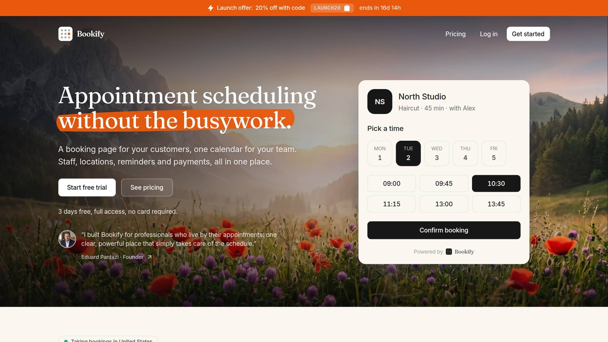
A founder statement appears directly below the main action.
See what changed ↗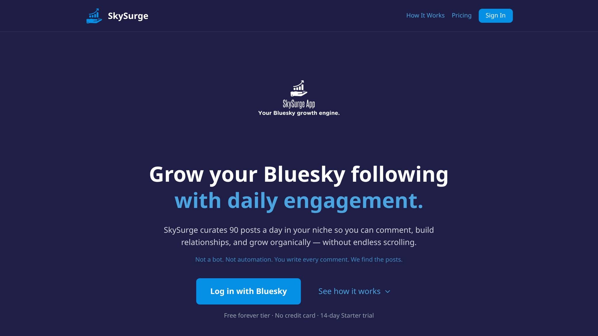
A playful slogan becomes an explicit Bluesky growth offer.
See what changed ↗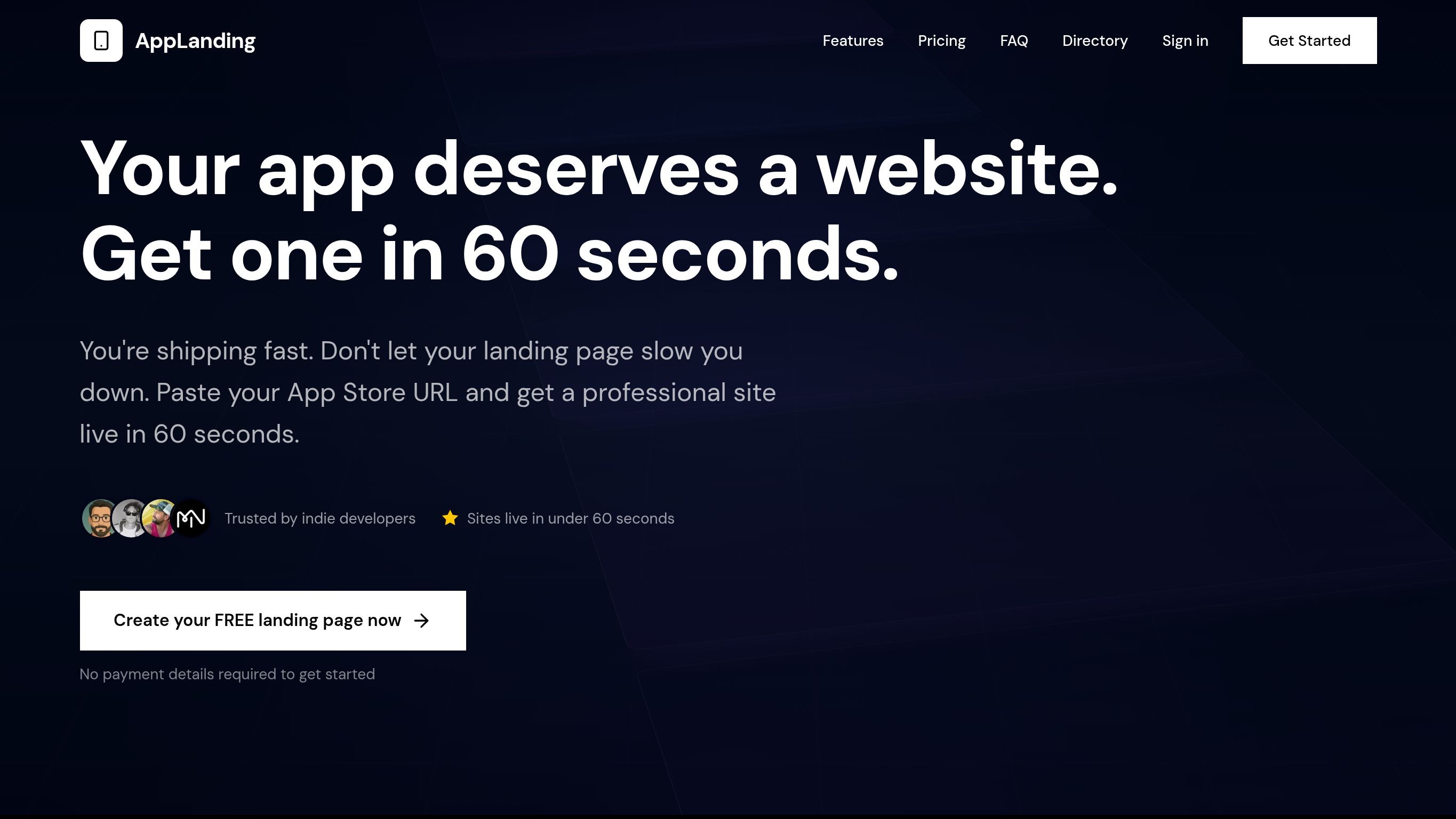
A broad promise becomes a concrete website offer, with visible social proof.
See what changed ↗YOUR PAGE, NEXT