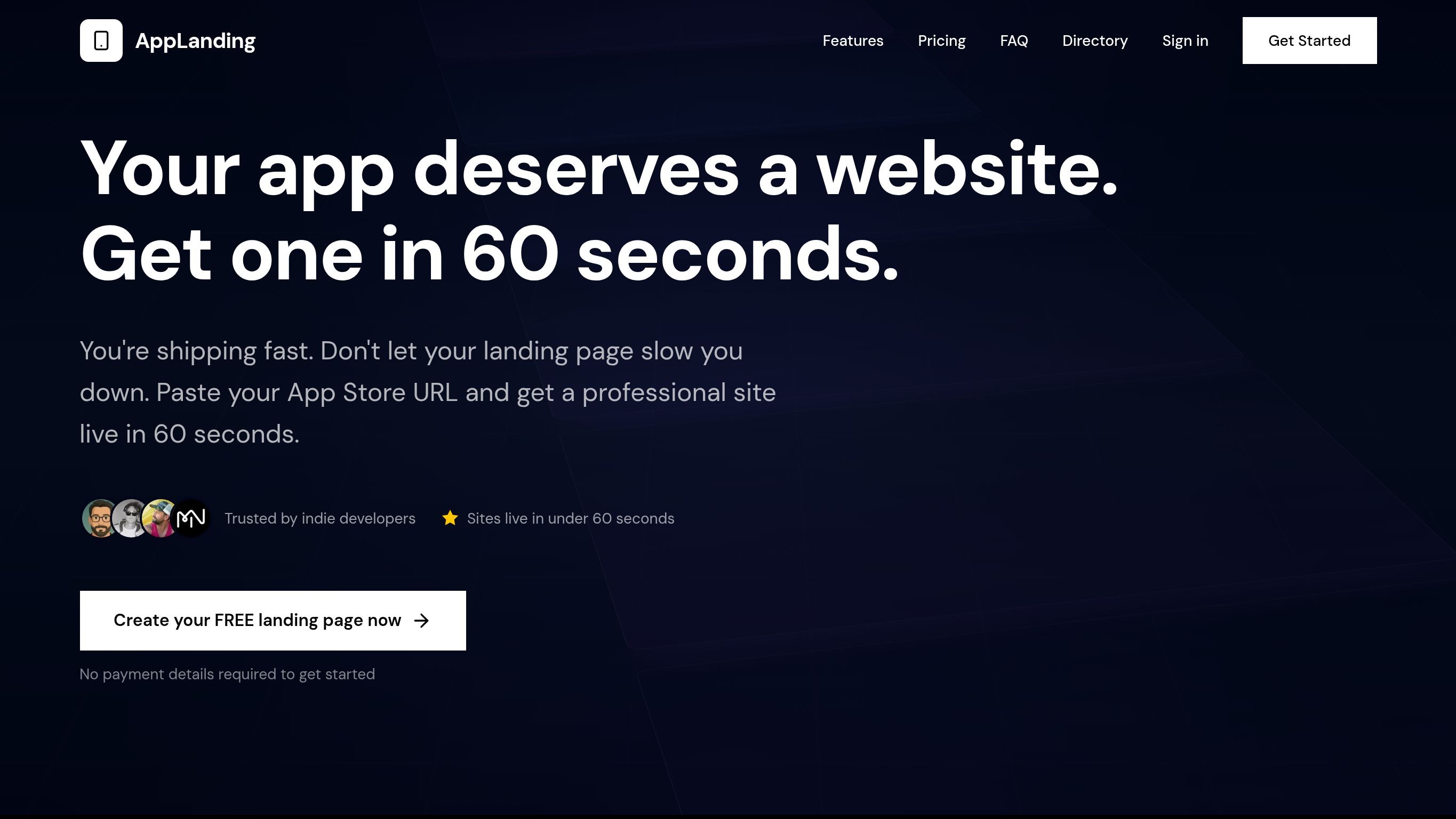
Make the promise specific. Put people beside it.
A broad promise becomes a concrete website offer, with visible social proof.
See what changed ↗LANDING PAGE EXAMPLES
See what changed between two real captures.
Take the idea. Inspect the evidence.
Actual screenshots from LandingBoost scan history. No generated “after” designs.
How we compare ↓A broad promise becomes a concrete website offer, with visible social proof.
See what changed ↗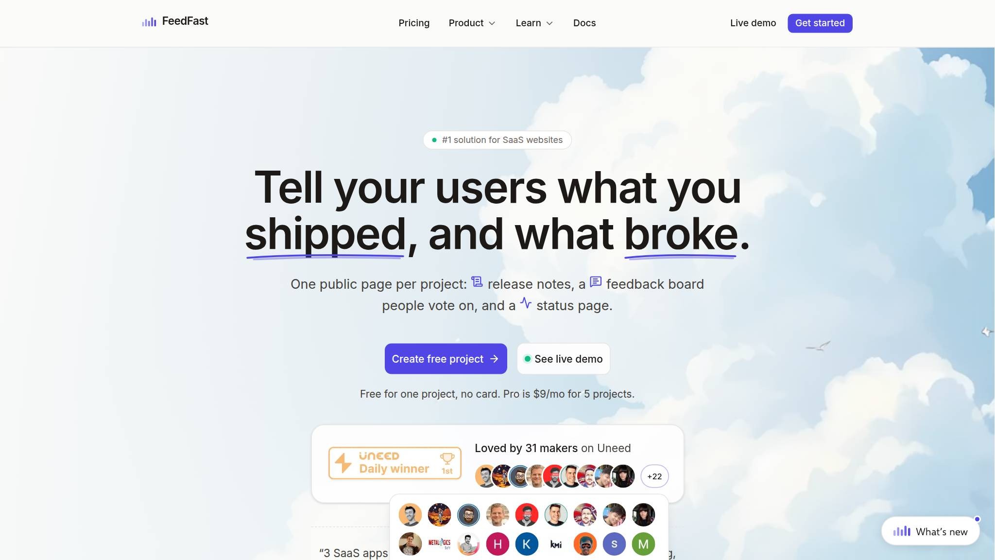
A more specific CTA and a review block change the decision area.
See what changed ↗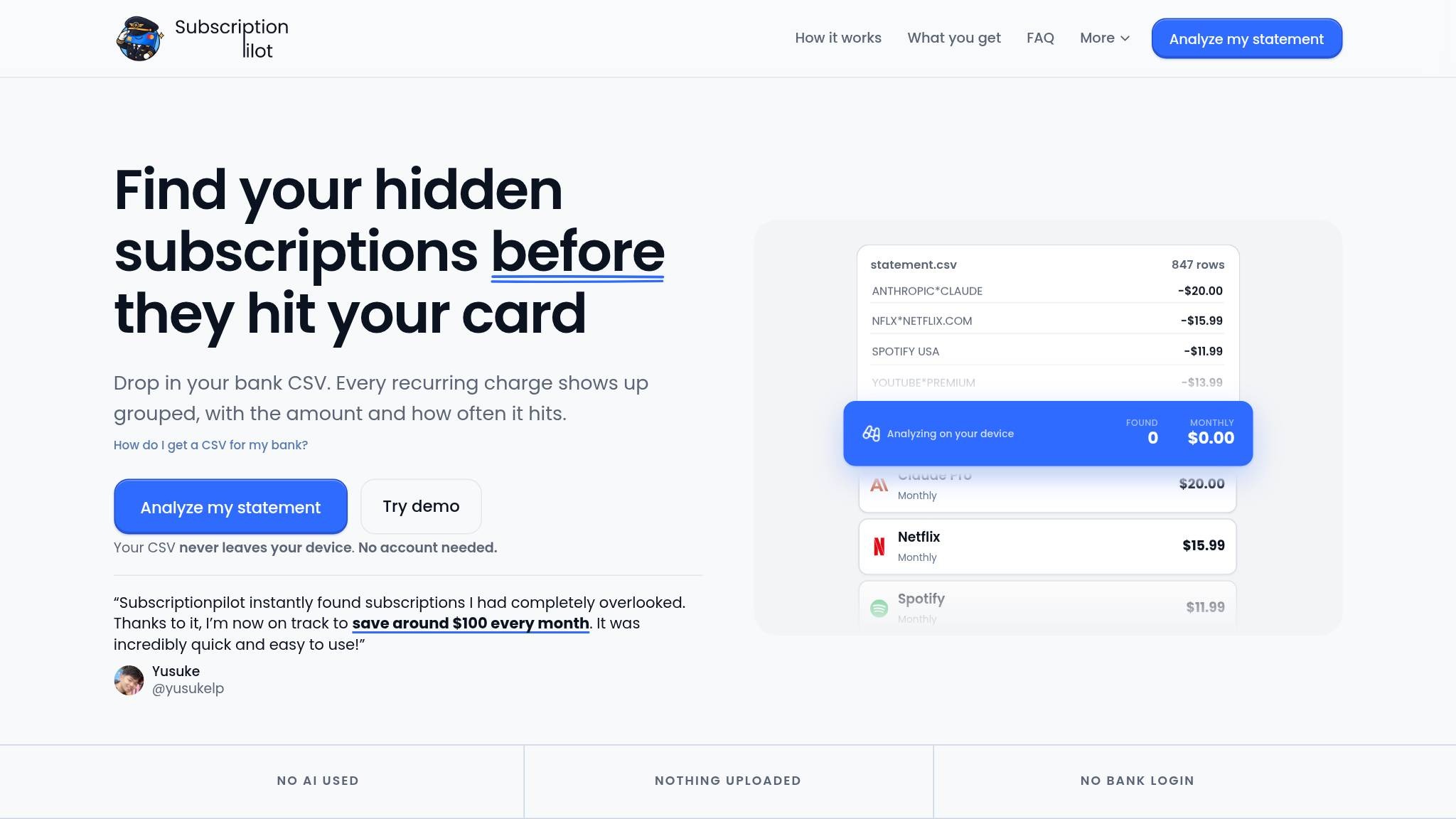
The same problem statement now leads into a usable product.
See what changed ↗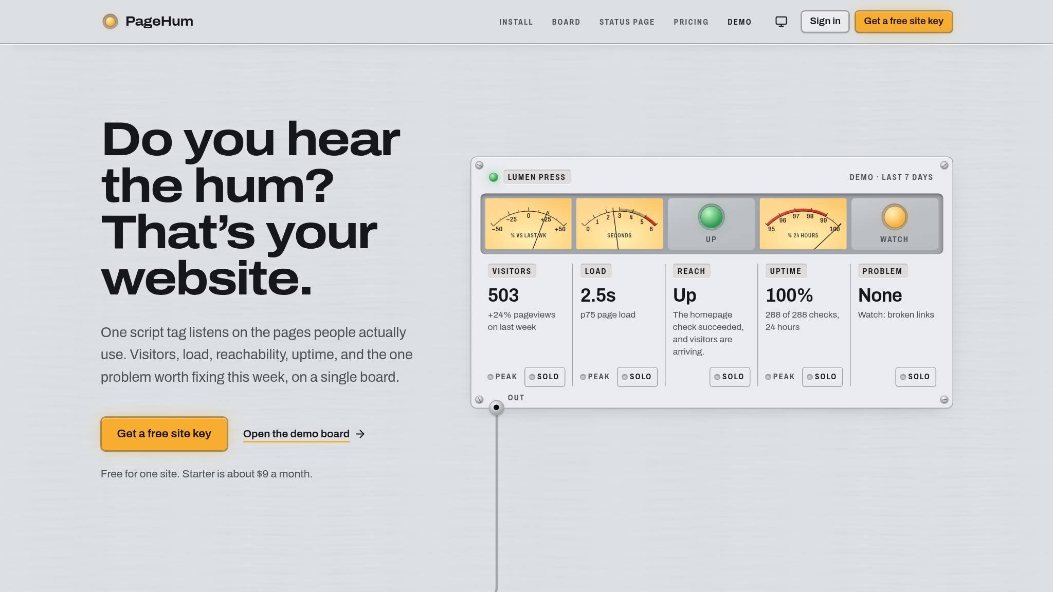
The monitoring product becomes visible inside the first impression.
See what changed ↗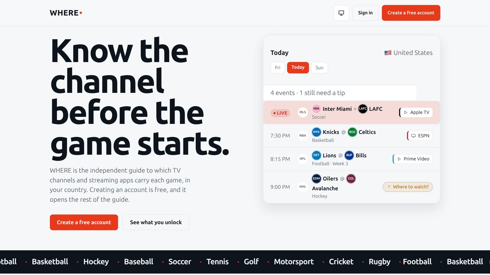
An events screen gains an introduction for first-time visitors.
See what changed ↗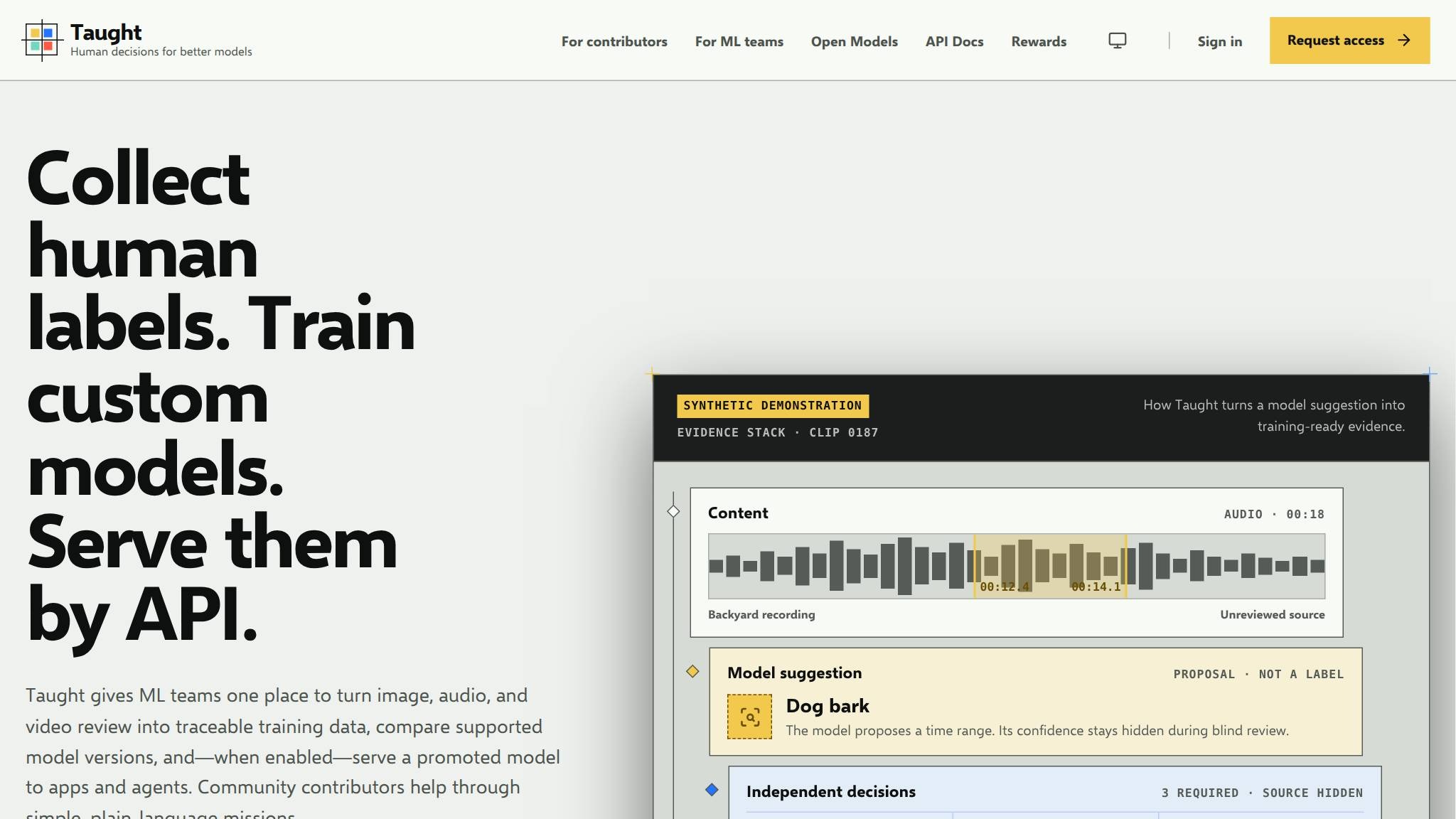
A broad machine-learning idea becomes a concrete three-step offer.
See what changed ↗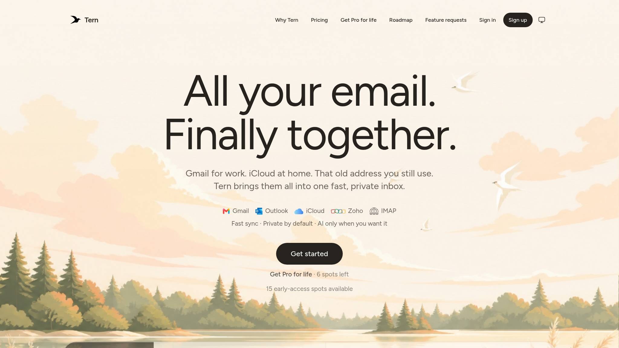
A waitlist invitation becomes a product entry point.
See what changed ↗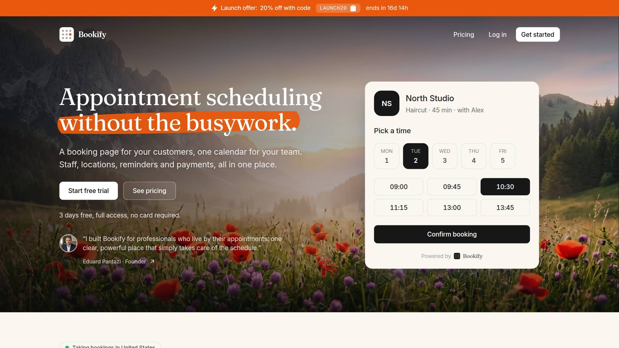
A founder statement appears directly below the main action.
See what changed ↗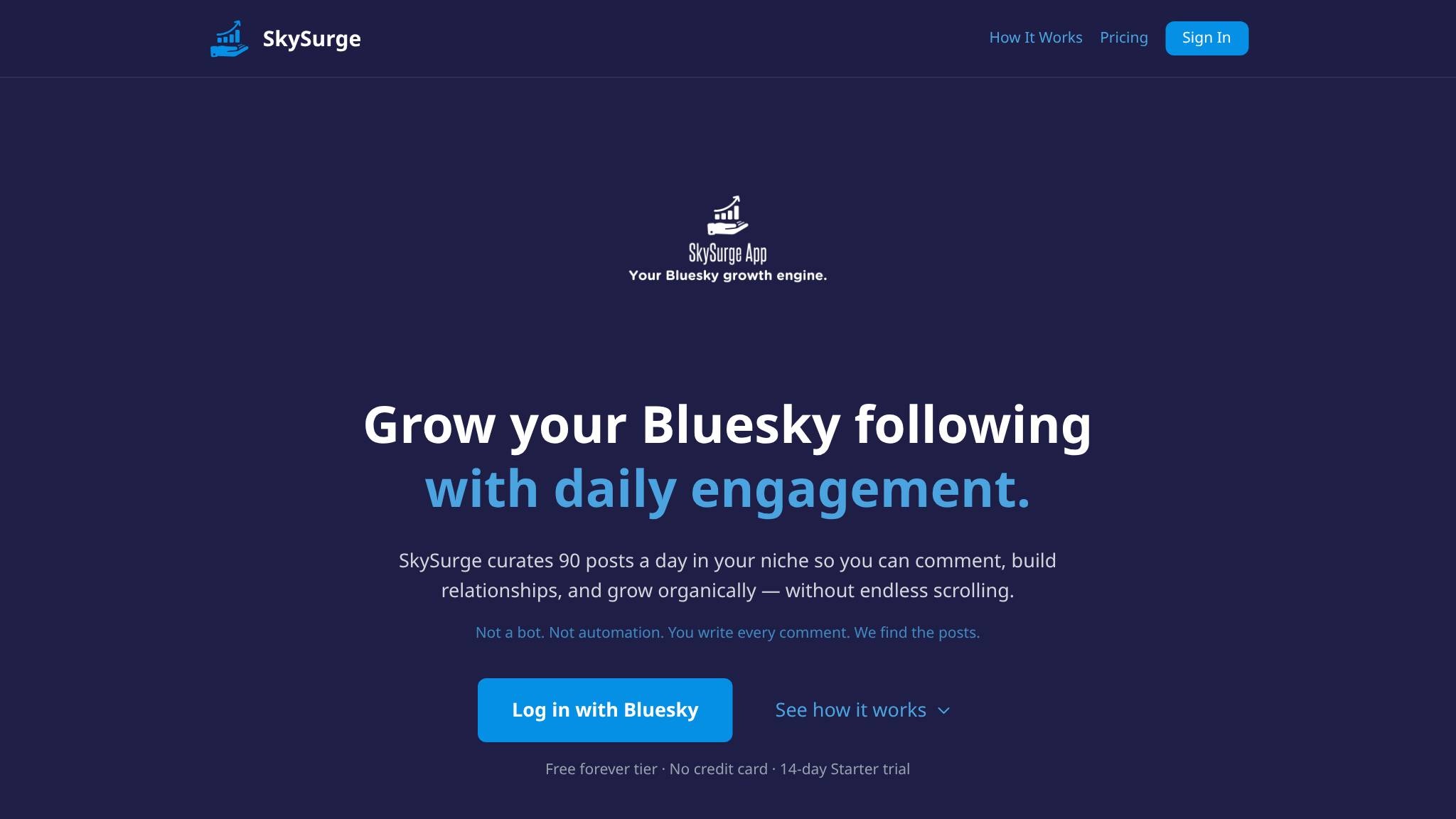
A playful slogan becomes an explicit Bluesky growth offer.
See what changed ↗
The first screen stopped selling atmosphere (“know stuff nobody else does”) and started selling a concrete habit: learn anything in the time it takes to make coffee — with stronger download proof next to the store buttons.
See what changed ↗
Same orange/white system, but the first screen stopped selling “AI fixes WordPress” and started answering site-down panic with a held payment and a clear refund path.
See what changed ↗
Before teaches CBT-I and shows a ritual checklist. After sets one night contract — no 1am scroll — with the lock-screen moment in the hero and honest pricing under the download.
See what changed ↗
Same dark directory look, but the page stopped sounding clever and started selling the job: list free, get found in Google and AI — with steps and countable proof under the CTA.
See what changed ↗
Layout barely moves — this is a copy and offer tighten: “stop guessing” became “already begged for,” and the $19 price moved into the primary button.
See what changed ↗
Same dark scanner frame and free scan input. After surrounds that input with customer score jumps and a named testimonial — so proof sits next to the action.
See what changed ↗WHAT THIS COLLECTION SHOWS
Dated screenshots saved by LandingBoost, compared visually. These are desktop captures, not mobile tests.
Each study distinguishes visible changes from the earlier suggestion. A match does not prove adoption.
Page changes and audit scores do not prove conversion or revenue gains. Each study explains what its evidence supports.
YOUR PAGE, NEXT