The purpose comes first
“Know the channel before the game starts” replaces “Today” as the main heading. A new visitor gets a product explanation before interpreting the schedule.
CLARITY / WHERE
The earlier capture opens with “Today” and an events list. The later page first explains the job: finding the channel before a game starts.
THE VISIBLE DIFFERENCE
“Know the channel before the game starts” replaces “Today” as the main heading. A new visitor gets a product explanation before interpreting the schedule.
The later introduction mentions TV channels, streaming apps, and the visitor’s country. It gives context to the listings that follow.
“Sign in” gives way to “Create a free account,” with a small event preview nearby. The page explains the offer before asking for access.
TAKE THIS IDEA
EARLIER LANDINGBOOST SUGGESTION
Add one real customer proof line with a concrete outcome directly under the primary CTA.
The earlier suggestion was a customer proof line near the CTA. It does not explain the larger move from an events-first screen to an introductory landing page. LandingBoost attribution is unconfirmed.
This is a substantial page change, rather than an isolated headline test. No account-creation or revenue outcome is available for the comparison.
No verified conversion or revenue result is attached to this pair. A scan or visual match does not establish ownership, adoption, or causality.
Ask new visitors what the product helps them find, then compare completed account creation per eligible visit.
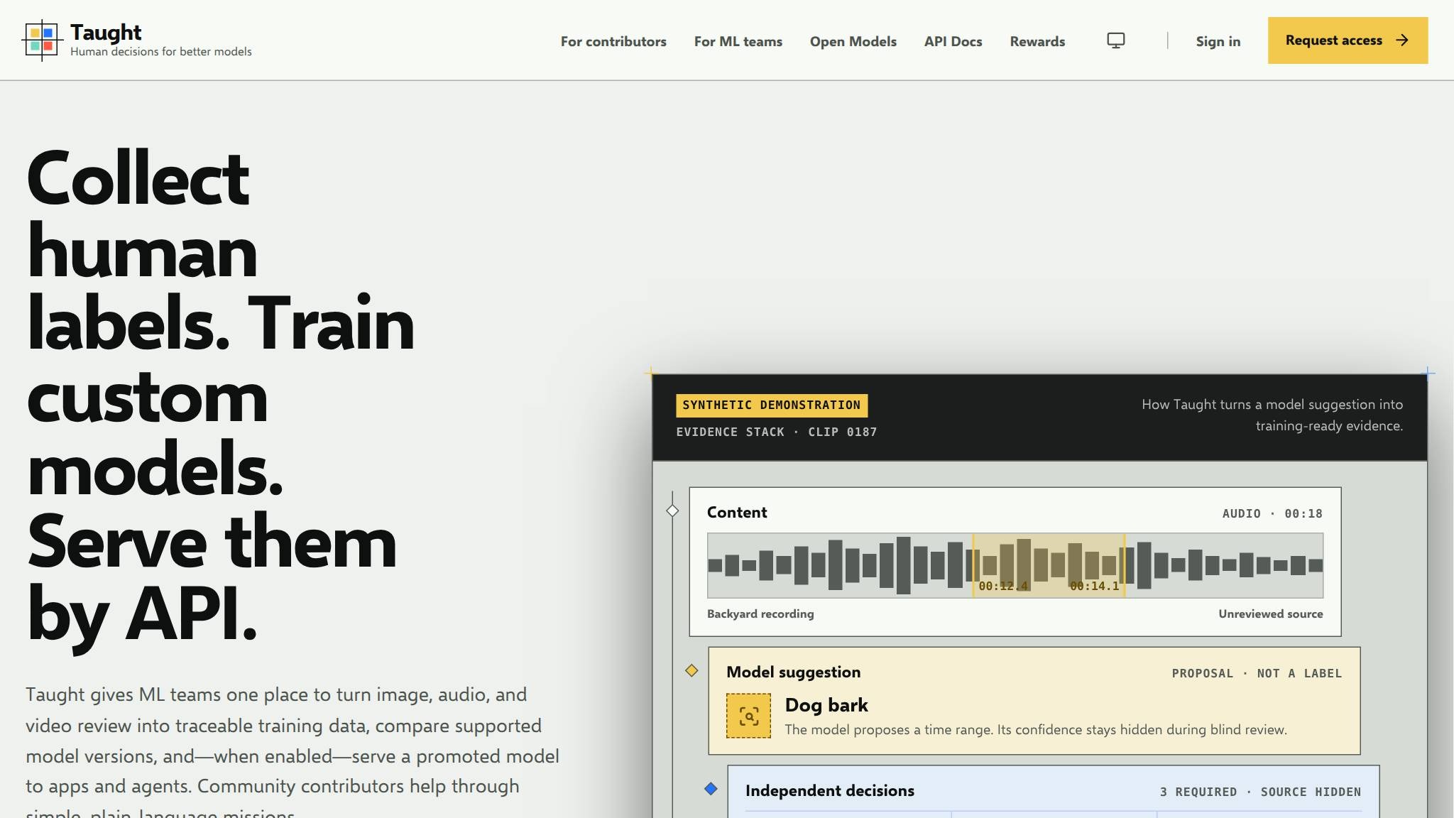
A broad machine-learning idea becomes a concrete three-step offer.
See what changed ↗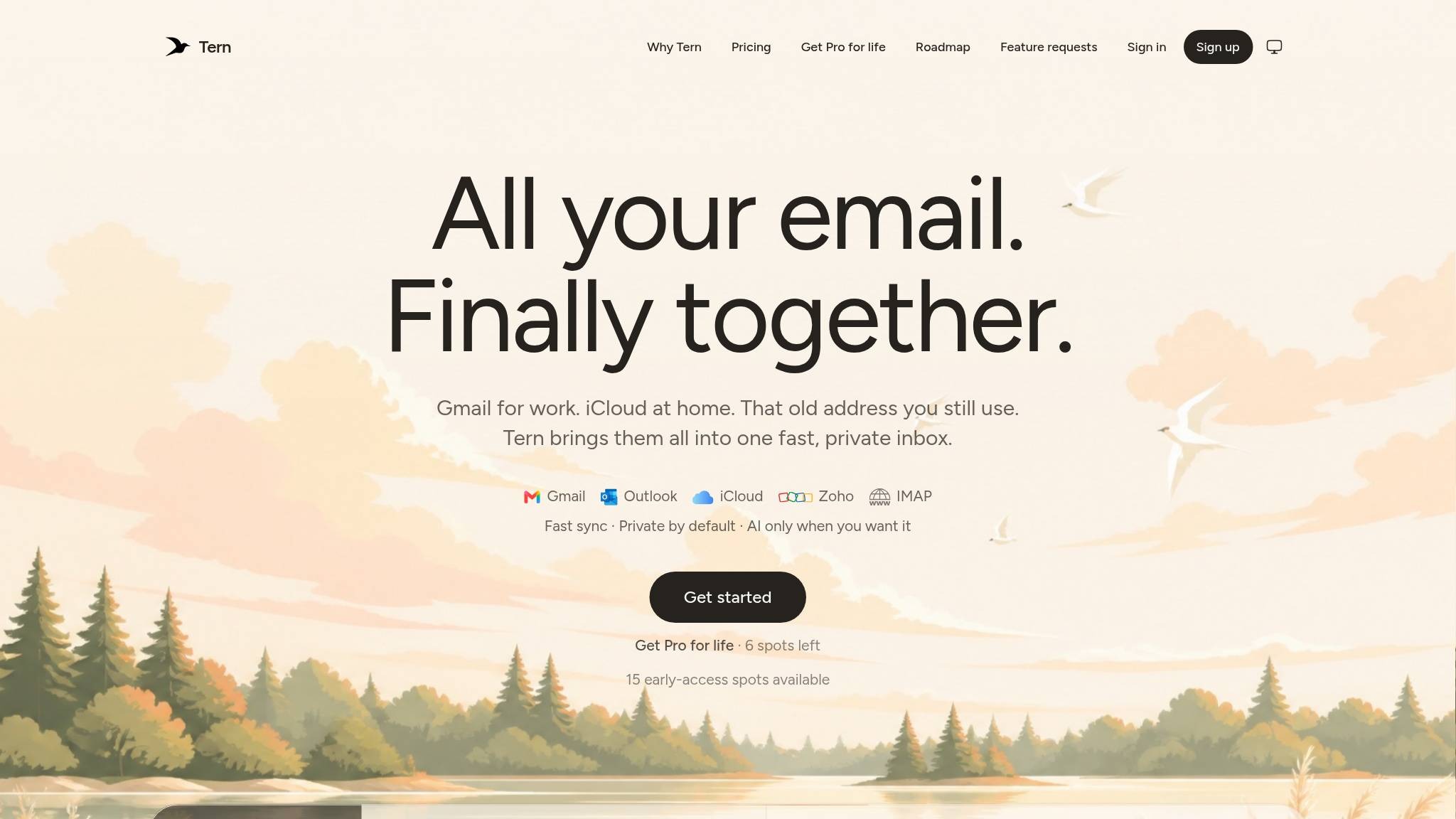
A waitlist invitation becomes a product entry point.
See what changed ↗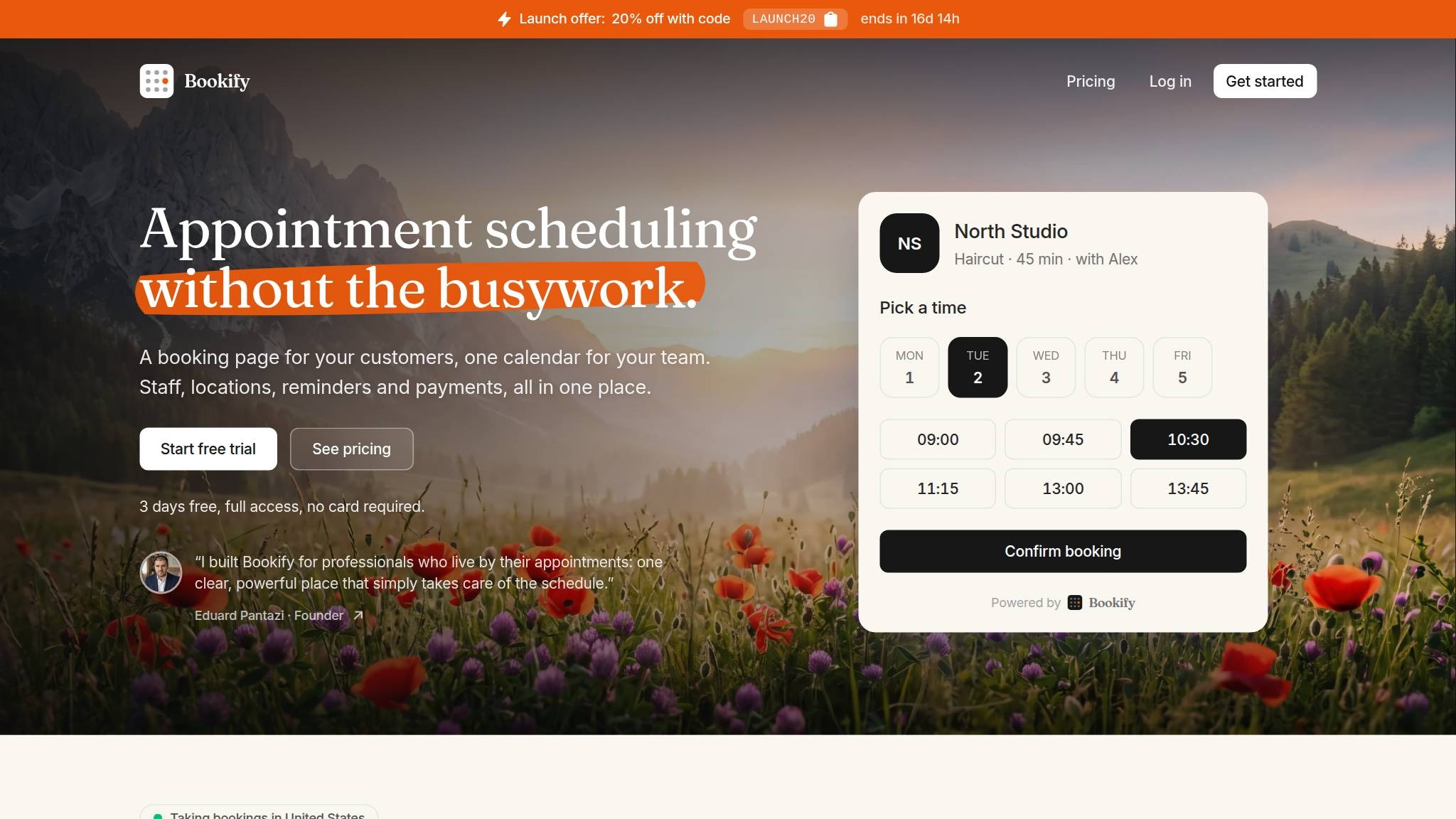
A founder statement appears directly below the main action.
See what changed ↗YOUR PAGE, NEXT