
Public teardown / ChatFrom
ChatFrom landing page teardown
I went through the whole page on a phone, with Rouzbeh’s OK. Five things I would change, each shown before and after on the real page.
- 19.6
- phone screens long
- 94
- words before the first button
- 12
- screens with no sign-up button in view
- 12.7
- screens down to the price
Fix 1 of 5
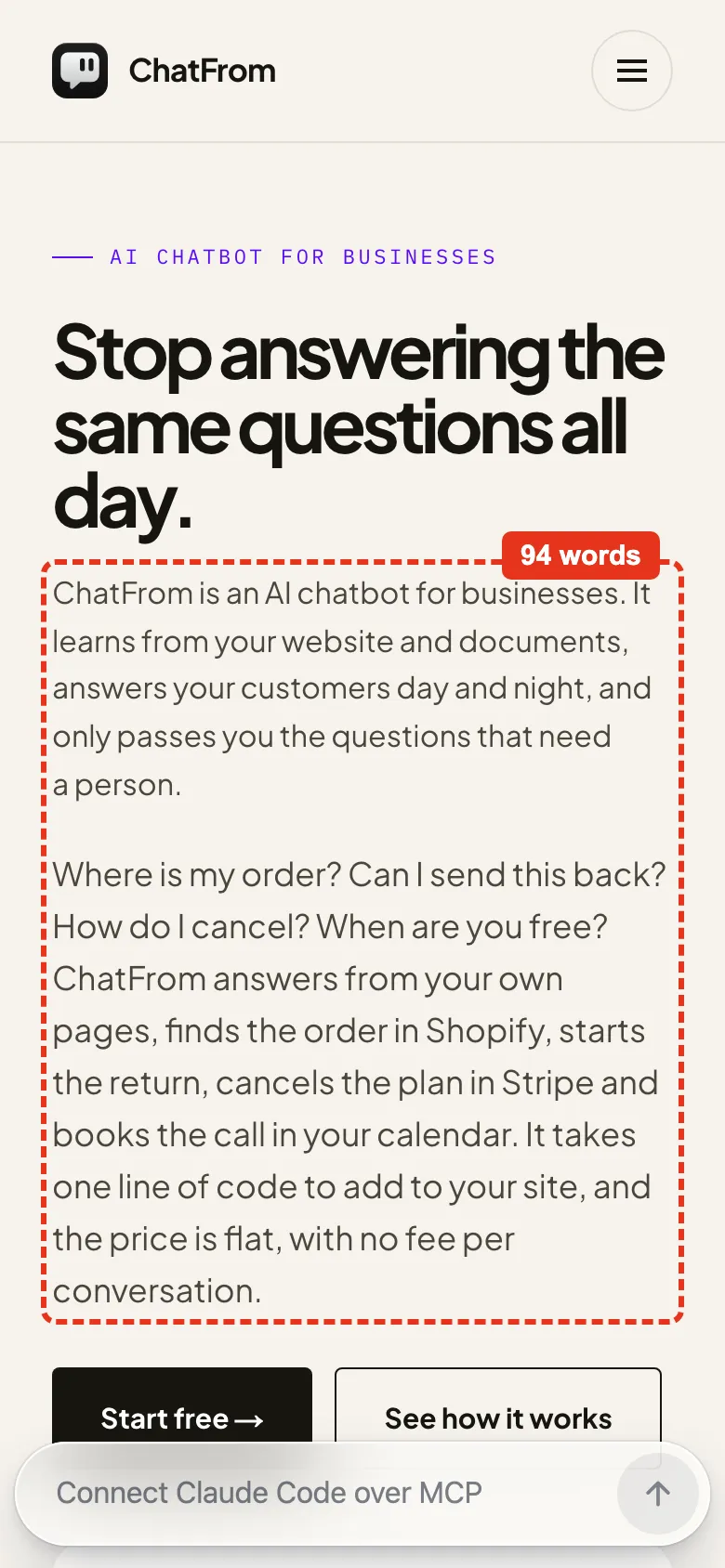
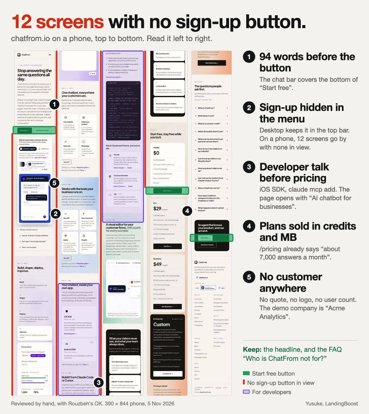
94 words before the button
What I found
On a 390 × 844 phone, two paragraphs sit between the headline and “Start free”: 30 words, then 64. The button lands at the very bottom of the screen, and the chat bar covers its lower edge.
The fix
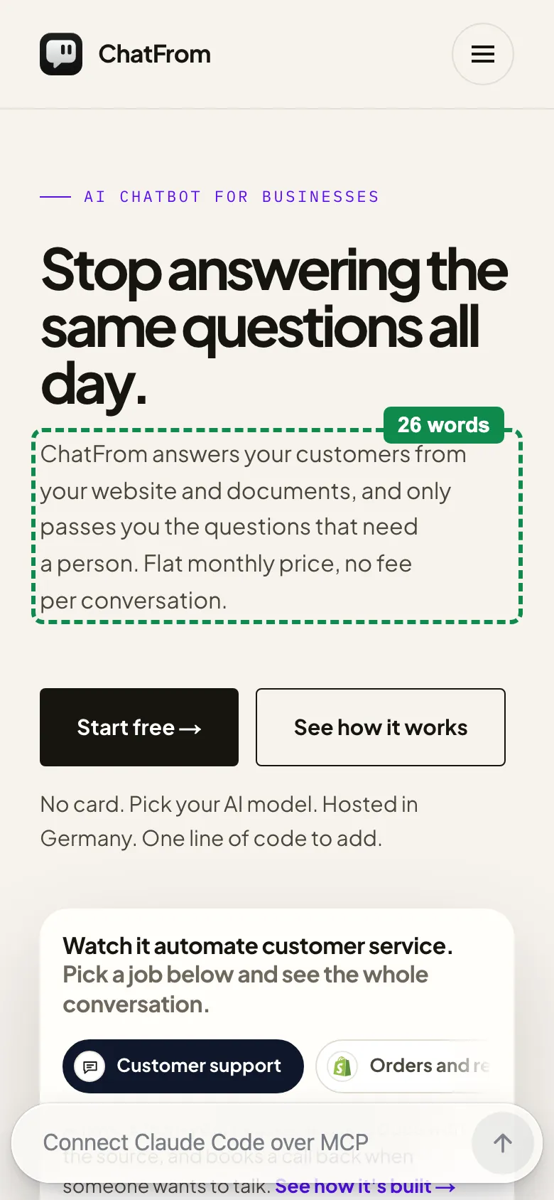
Keep the headline. Cut the first paragraph to 26 words, and move the second below the demo, so those words stay on the page. The button moves up 252 pixels and the chat bar no longer touches it.
ChatFrom answers your customers from your website and documents, and only passes you the questions that need a person. Flat monthly price, no fee per conversation.
Fix 2 of 5
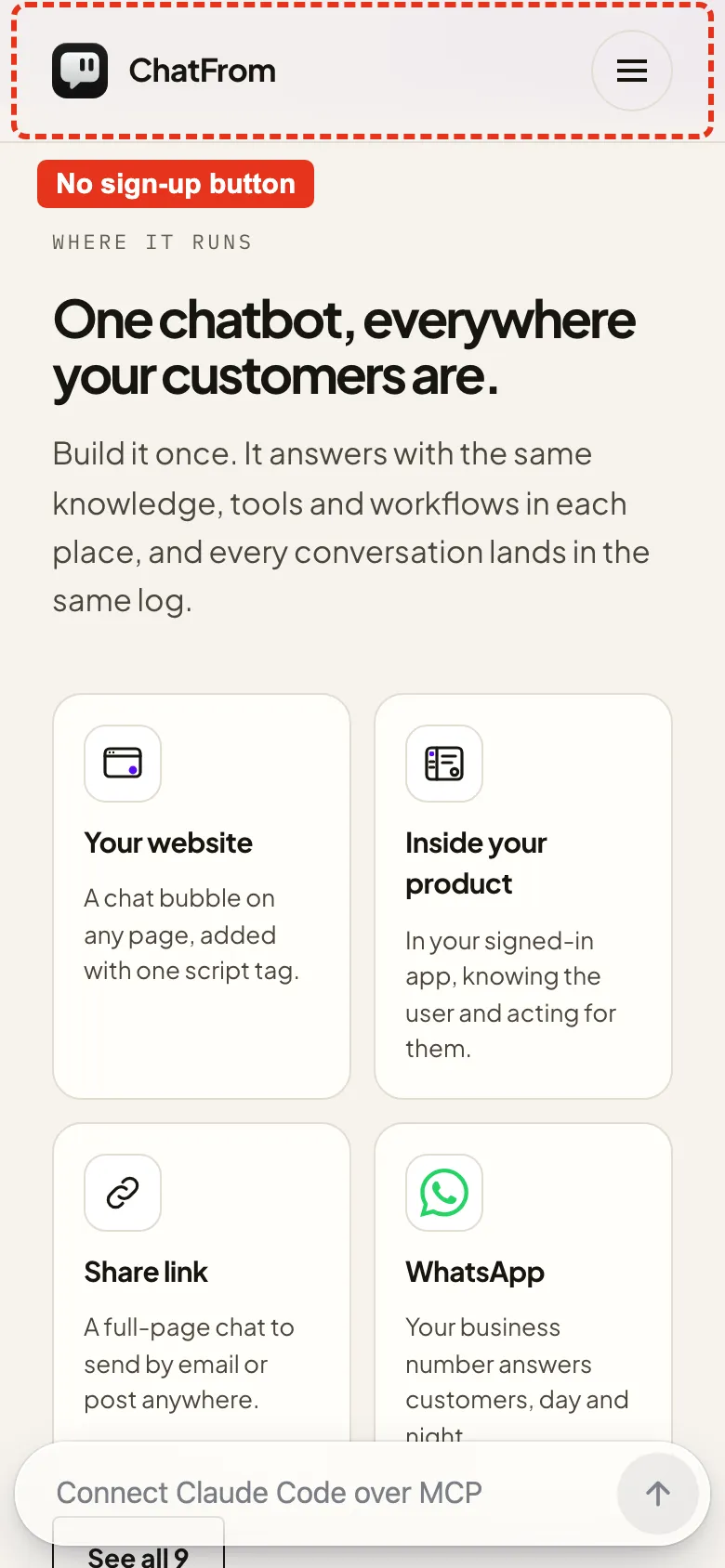
12 screens with no sign-up button in view
What I found
After the first “Start free”, the next one is 12.4 screens further down. On desktop, the top bar keeps “Start free” in view. On a phone, the top bar has the logo and the menu, and the button sits inside the menu.
The fix
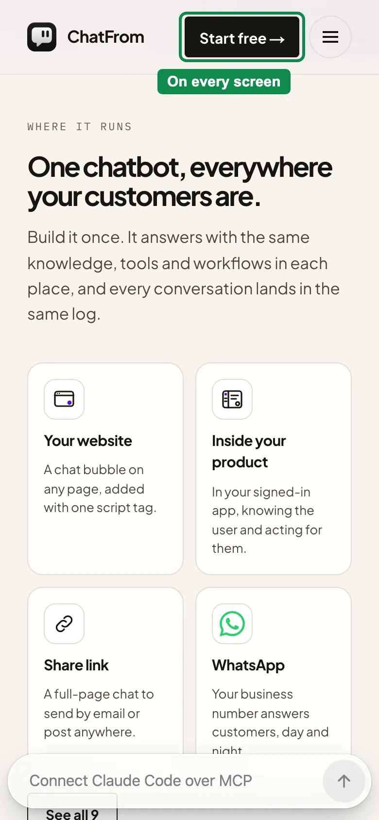
Put “Start free” in the phone’s top bar. Same button, same link, so one is in view on every screen.
Fix 3 of 5
Developer talk before the price
What I found
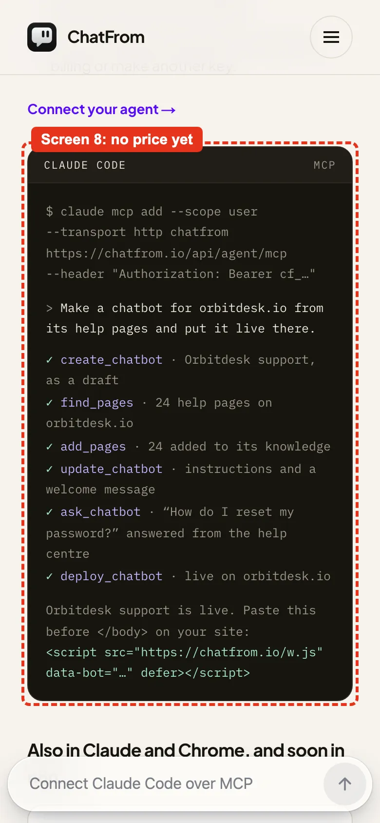
The page opens with “AI chatbot for businesses”. Before a phone visitor reaches the price, they get an iOS SDK section and then a terminal block that starts with claude mcp add.
The fix
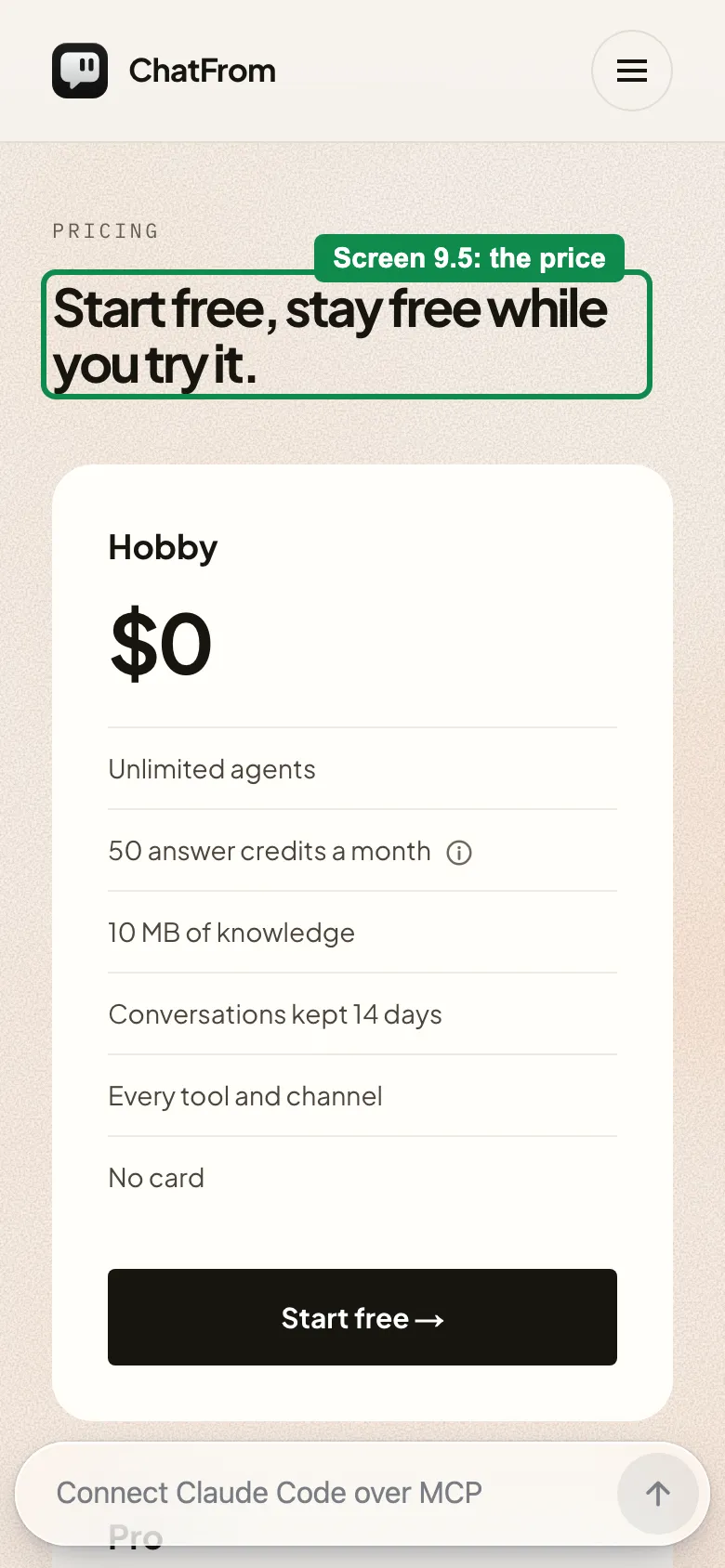
Move those two sections below pricing. Nothing is deleted. The pricing heading moves from screen 12.7 to screen 9.5.
Fix 4 of 5
Plans sold in credits and megabytes
What I found
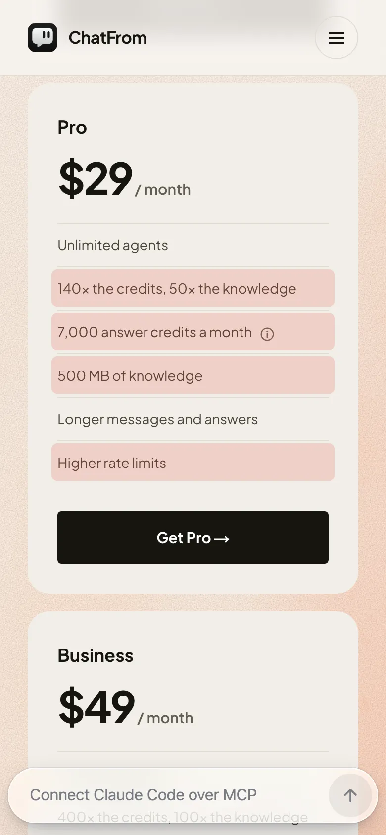
The Pro card says “140× the credits, 50× the knowledge”, “7,000 answer credits a month” and “500 MB of knowledge”. That is hard to picture when you are comparing chatbots.
The fix
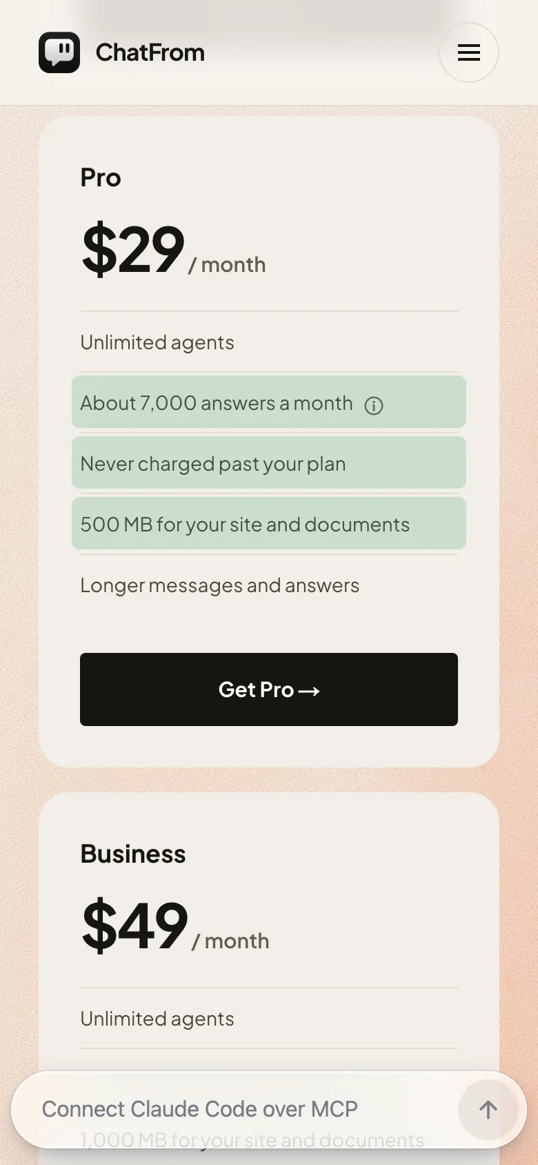
ChatFrom’s own pricing page already has plainer words: about 7,000 answers a month on the default model, and you are never charged past your plan. Put those on the card, and keep the info icon, because the number depends on the model.
Fix 5 of 5
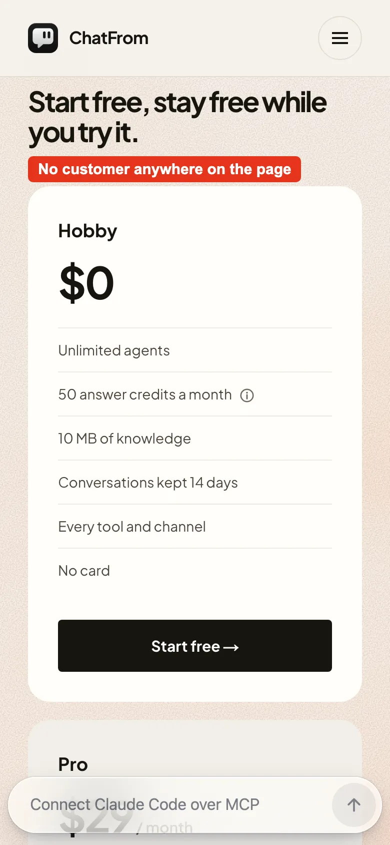
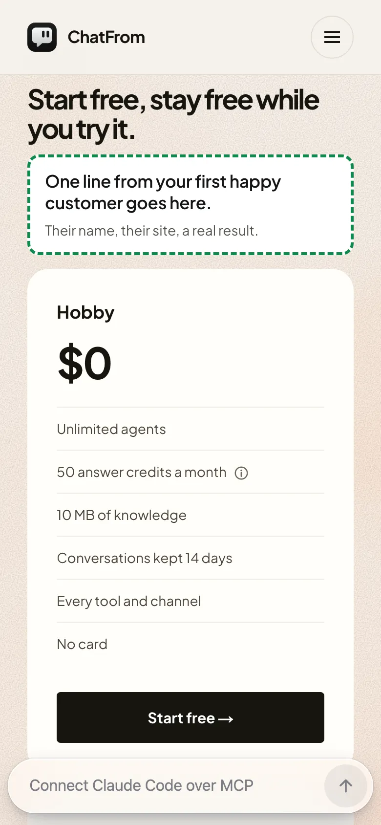
No customer anywhere on the homepage
What I found
I found no quote, no customer logo and no user count on the homepage. The demo company is called Acme Analytics.
The fix
This is the one fix I can’t write for them. Leave a spot next to the price, hidden until a real customer gives one line: their words, their name, their site. The box on the right only shows where it would go.
The whole page in one picture
What I would keep: the headline, “Stop answering the same questions all day.”, and the FAQ question “Who is ChatFrom not for?”. I wish more pages had that one.
Try this on your own page
- Open your page on a phone and count the words between the headline and the first button.
- Keep scrolling, and count the screens where no sign-up button is in view.
- Count the screens until the first price.
- Read your plan cards out loud. Replace any unit a first-time visitor would have to look up with what they actually get.
- Look for one real customer on the page. If there is none yet, ask your first happy user for one line.
What this does not prove
These are previews on the real page, captured on 5 Nov 2026. None of it was live when this was published.
Shorter copy and a visible button do not prove more sign-ups. There is no sign-up data behind this teardown yet.
Rouzbeh replied on X: “I'm going to implement all of your comments.” If results are shared later, they will be added here with their date.