
Public teardown / CoMStudio
CoMStudio homepage teardown
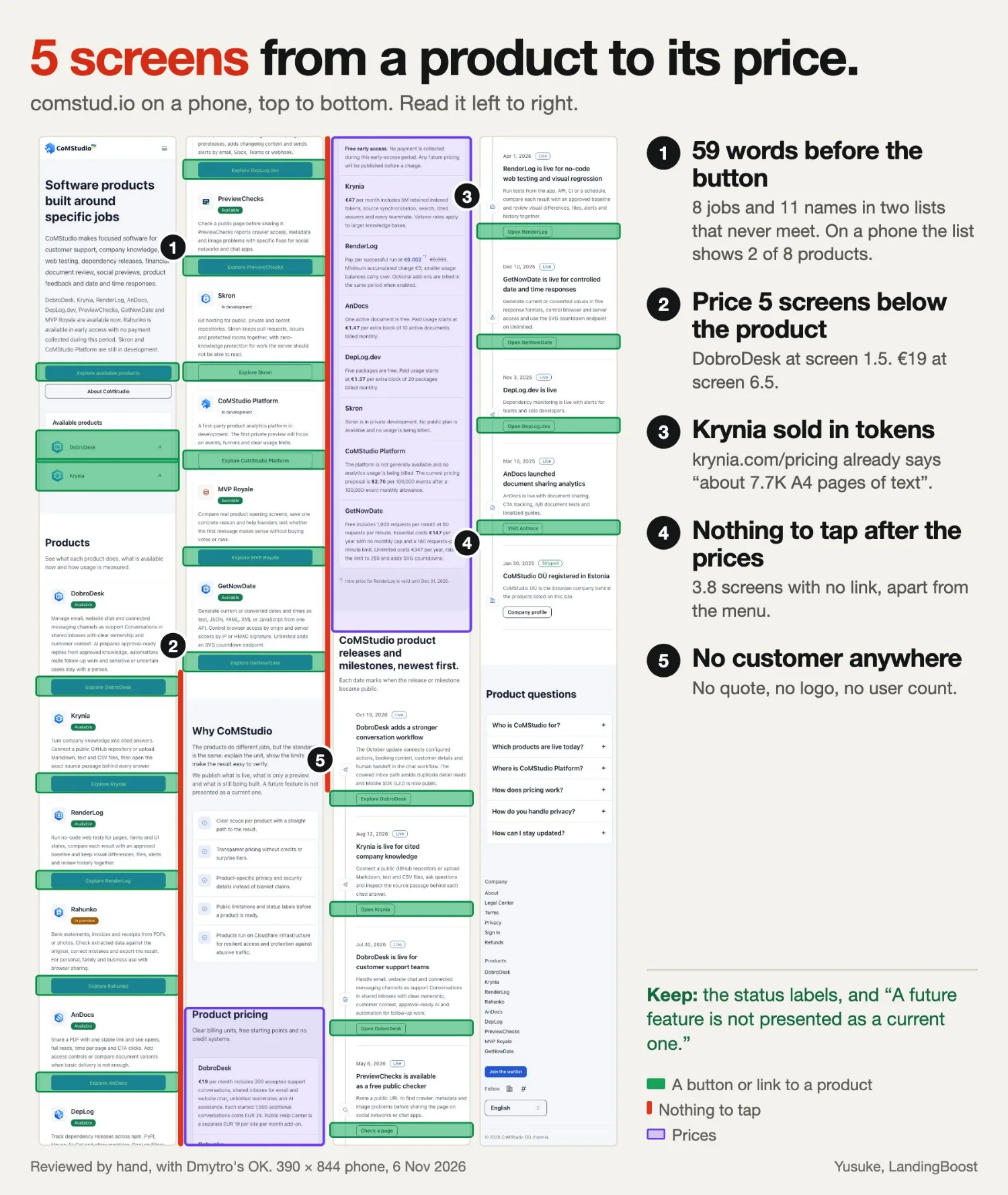
I went through the whole page on a phone, with Dmytro’s OK. Five things I would change, each shown before and after on the real page.
- 13.5
- phone screens long
- 59
- words before the first button
- 5
- screens from a product to its price
- 3.8
- screens with nothing to tap after the prices
Fix 1 of 5
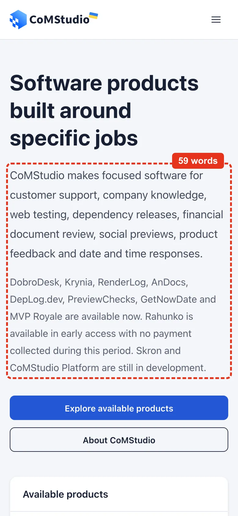
59 words before the button
What I found
On a 390 × 844 phone, two paragraphs sit between the headline and “Explore available products”: 25 words listing eight jobs, then 34 words listing eleven product names and their status. Nothing says which product does which job. Below the buttons, the “Available products” box shows 2 of its 8 rows on a phone. Desktop shows all 8.
The fix
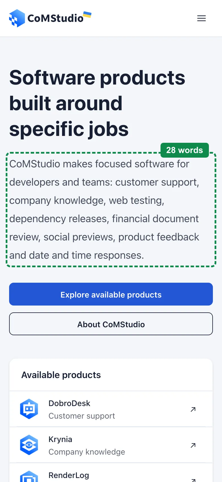
Keep the headline and the job list. Add who it is for at the start of that sentence, words the page title already uses. Move the product-name paragraph, word for word, to the top of the Products section, so no word leaves the page. Then give each row in the box its job, and show all 8 rows on a phone.
CoMStudio makes focused software for developers and teams: customer support, company knowledge, web testing, dependency releases, financial document review, social previews, product feedback and date and time responses.
Fix 2 of 5
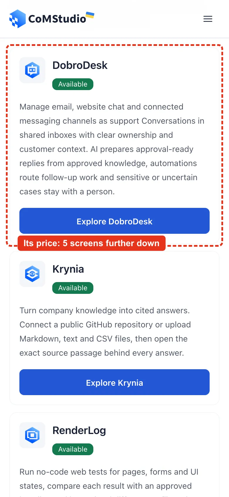
The price is 5 screens below the product
What I found
On a phone, the DobroDesk card is on screen 1.5. Its price, €19 per month with 300 accepted support conversations, is on screen 6.5, in a separate pricing section. Every product works the same way.
The fix
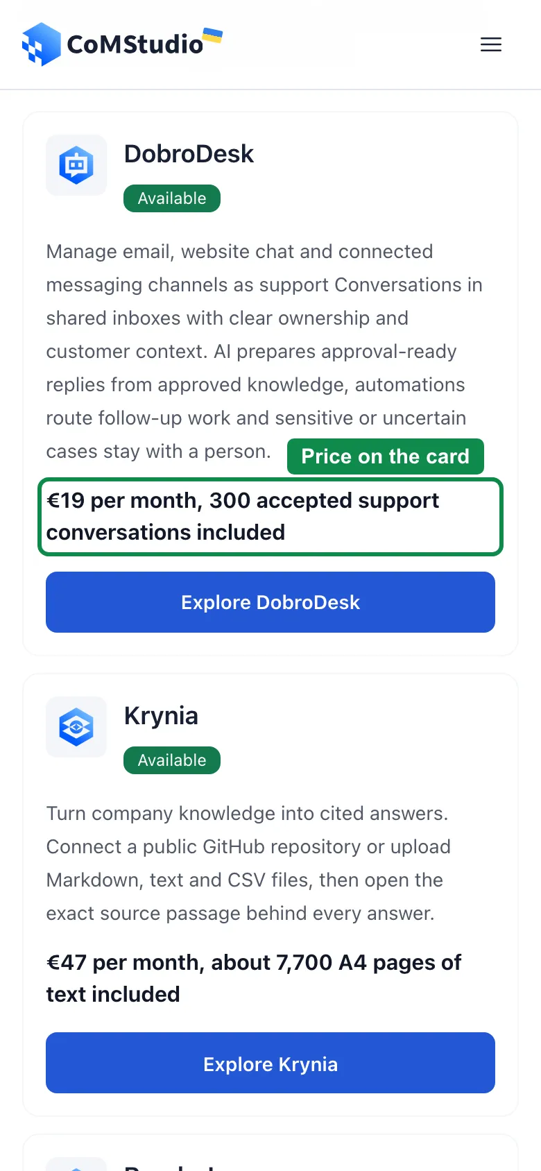
Add the first line of each price to its product card, right above its button. Keep the pricing section as it is.
€19 per month, 300 accepted support conversations included
Fix 3 of 5
Krynia sold in tokens
What I found
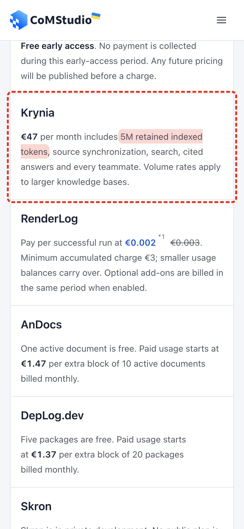
The Krynia price reads “€47 per month includes 5M retained indexed tokens”. A first-time visitor can’t picture that, and the page itself promises to “explain the unit”.
The fix
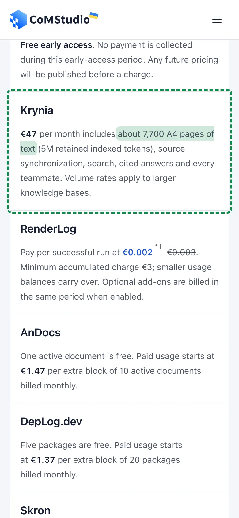
Krynia’s own pricing page already says it in plain words: 5M indexed tokens is about 7.7K A4 pages of text. Lead with the pages and keep the tokens in brackets.
€47 per month includes about 7,700 A4 pages of text (5M retained indexed tokens)
Fix 4 of 5
Nothing to tap after the prices
What I found
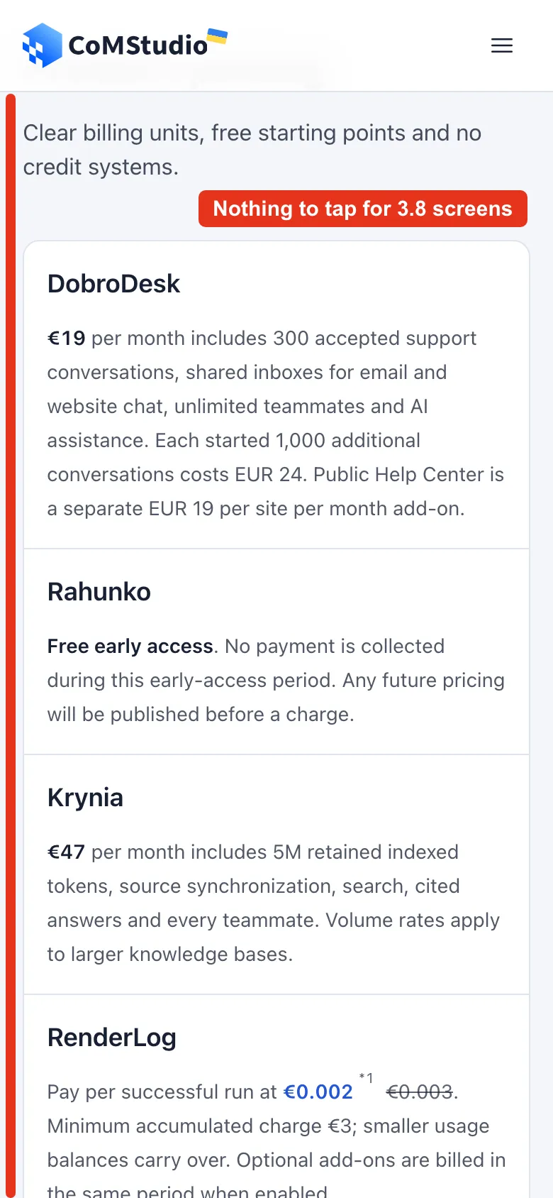
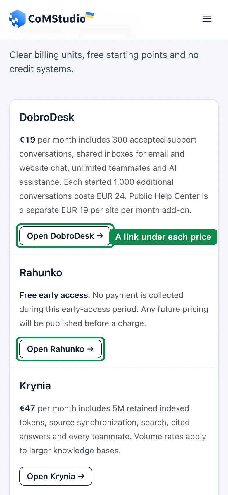
The pricing section has no links. From the last product button to the first link in the release timeline, 3.8 phone screens go by with nothing to tap except the menu.
The fix
Put a small link under each price that opens that product’s page. The longest stretch without a link drops to about 1.5 screens.
Fix 5 of 5
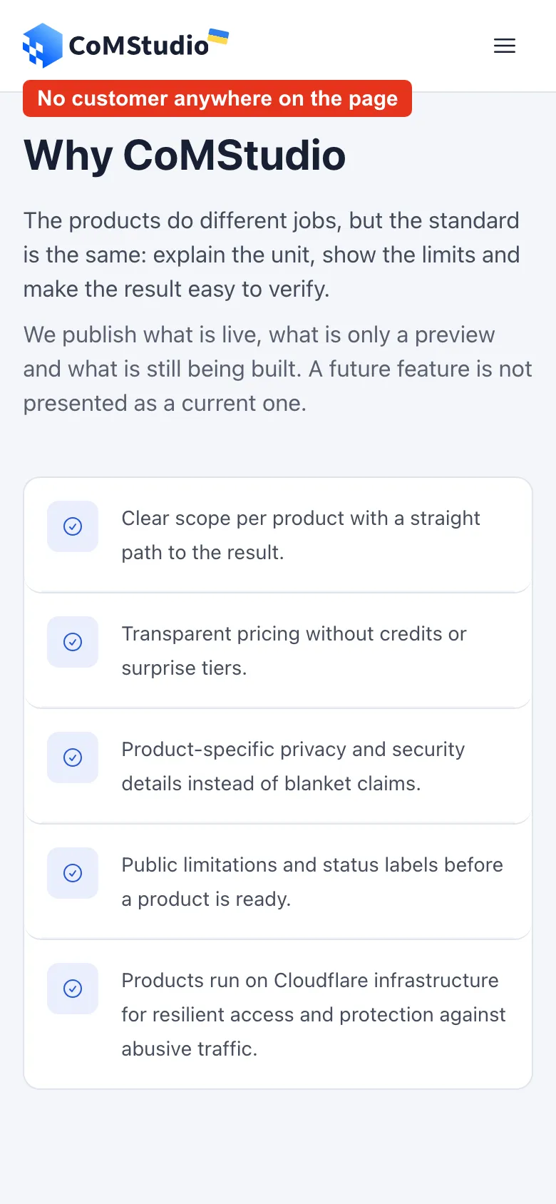
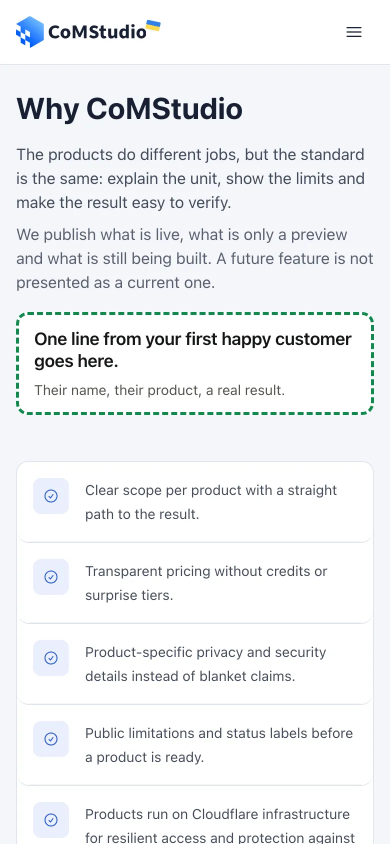
No customer anywhere on the homepage
What I found
I found no quote, no customer logo and no user count on the homepage. The only logos are the products’ own.
The fix
This is the one fix I can’t write for them. Leave a spot in “Why CoMStudio”, hidden until a real customer gives one line: their words, their name, their product. The box on the right only shows where it would go.
The whole page in one picture
What I would keep: the status labels (Available, In preview, In development) and the line “A future feature is not presented as a current one.” I wish more pages had it.
Try this on your own page
- Open your page on a phone and count the words between the headline and the first button.
- Check that each product or plan sits next to what it does and what it costs.
- Read your prices out loud. Replace any unit a first-time visitor would have to look up with what they actually get.
- Scroll past your prices and check that something to tap is always close.
- Look for one real customer on the page. If there is none yet, ask your first happy user for one line.
What this does not prove
These are previews on the real page, captured on 6 Nov 2026. None of it was live when this was published.
No words were removed in these previews. The job list stays in the first screen, and the product-name paragraph moves lower on the page, word for word.
Moving text and adding links does not prove more sign-ups. There is no sign-up data behind this teardown yet.