Skip to content

AI-look check · checked 9 Nov 2026

gdprfix.eu

87/100

Hand-made score

100 minus 13 points for 3 findings.

Looks hand-made

More hand-made than 55% of the 599 sites checked.

Between Zapier (86) and Vercel (89).

How far this homepage looks from what AI site builders (Lovable, Bolt and the like) put on a page by default. Not a probability that AI made it.

gdprfix.eu as the check opened it, in a desktop window.Pills
The first screen, with the findings there marked.

3 of 13 defaults found

What pulls it toward the builder default.

Strongest first. Each one marked on the page, with what to change.

Emoji in the copy−8

6 emoji in the text.

On 24% of Lovable-built pages, at most 16% in any hand-made group (famous sites).

To change the look. Take the emoji out of the copy; words or your own pictures say it more clearly.

Small pills everywhere−3

16 small rounded labels (pills) around the page.

On 37% of Lovable-built pages, at most 21% in any hand-made group (gallery small sites 2025-26).
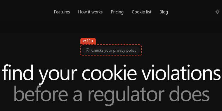
Small pills everywhere on gdprfix.eu, marked with a dashed box.

To change the look. Keep one label style for the one thing that needs it (a plan that is new, say) and turn the rest into plain text.

Big round corners−2

13 of its 17 cards and panels have corners of 12px or more.

On 48% of Lovable-built pages, at most 34% in any hand-made group (gallery small sites 2025-26).

To change the look. Pick one corner radius of your own (smaller, or none) and use it on every card and button.

A different look will not, by itself, get you sign-ups.

There is no scientific evidence that looking AI-made affects conversion. What does stop visitors can be measured: LandingBoost’s main scan opens gdprfix.eu on a phone and a desktop and marks what blocks a first-time visitor, with the fix in your own words.

Also on this page, not counted (7)

Traits people often call AI-made. Each was measured the same way and left out of the score, for the reason given:

  • Other icons in tiles · 18 icons sit in a matching rounded tile. On 4 of 145 Lovable-built pages: under the 1 in 10 the rule asks for.
  • Frosted glass · 2 panels use a background blur (frosted glass). 46% of Lovable-built pages against 41% of SaaS pages picked by design galleries (2025-26): not 1.3 times as common.
  • Pill above the headline · "Scan free" sits in a pill above the headline. 36% of Lovable-built pages against 29% of SaaS pages picked by design galleries (2025-26): not 1.3 times as common.
  • Cards inside cards · 4 cards sit inside another card. 24% of Lovable-built pages against 38% of famous sites: not 1.3 times as common.
  • Centred headline · A centred headline. 48% of Lovable-built pages against 53% of famous sites: not 1.3 times as common.
  • Inter, Geist or system font · Body text in ui-sans-serif. 56% of Lovable-built pages against 46% of small sites from 2019-21: not 1.3 times as common.
  • FAQ accordion · An FAQ accordion. 32% of Lovable-built pages against 66% of famous sites: not 1.3 times as common.

What keeps it hand-made

  • No Lucide icons in matching tiles side by side.
  • The headline is not in the stock extra-bold weight.
  • Its colours are its own, not Tailwind’s default palette.
  • Em dashes used sparingly.
  • No blurred glow behind the content.
  • No stock preset shadows.

Next step

Looks are one question. Make it convert.

There is no scientific evidence that looking AI-made affects conversion. What stops a first-time visitor from signing up can be measured, and that is what LandingBoost’s main scan does: it opens your pages on a phone and a desktop and marks a button under a cookie banner, a plan with nothing to tap, two prices that disagree. Each with the fix in your own words. Free: 1 AI scan a month, no card needed.

Results are public at their own link and never listed, except the famous sites on the board. Your site and you want this page gone? Write to [email protected].