
Redesign teardown / Supabird
Supabird landing page redesign: before and after
Fred makes Supabird and just rebuilt supabird.io. Fred says the new page converts 2x better, so I put the old page next to the new one and went through it section by section. Here are the six changes, each shown on the real pages.
- 6
- changes, section by section
- 3 → 6
- “Start My Free Trial” buttons on the page
- 78 → 8,456
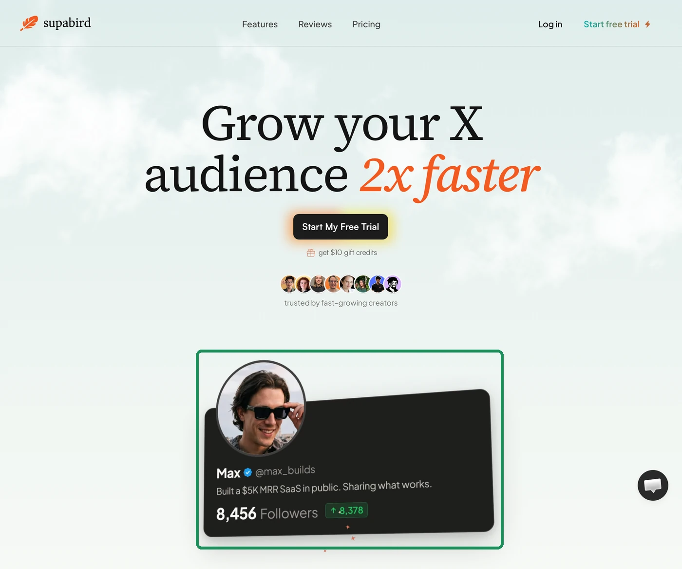
- followers in the new hero animation
- Same
- pricing card, before and after
Change 1 of 6
Six feature cards became one profile that grows
Before
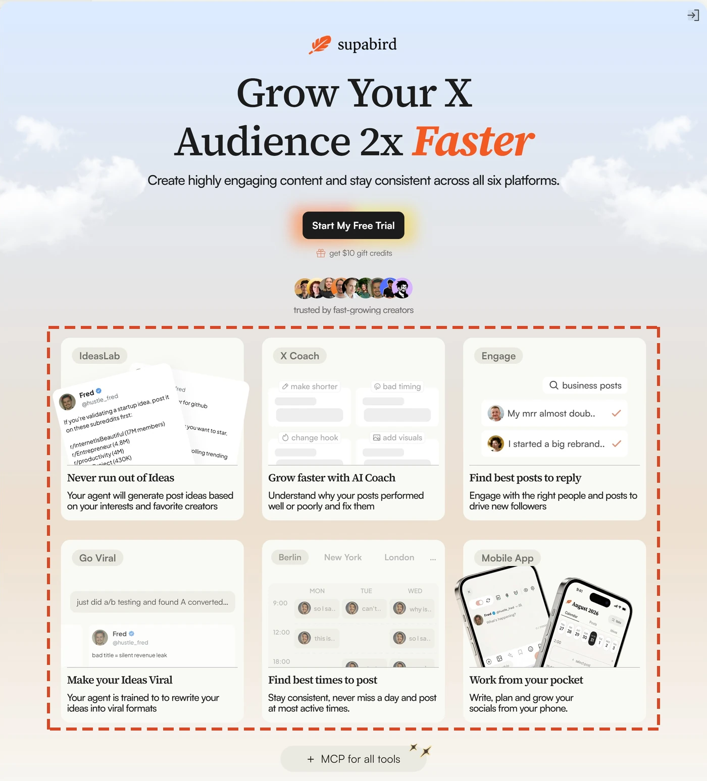
The headline “Grow Your X Audience 2x Faster” had a line of copy under it, then six feature cards from IdeasLab to Mobile App, plus “MCP for all tools”.
After
The headline stays, the line under it is gone, and one profile card plays in a loop. It grows from 78 followers to 8,456 while features like Engage and Cross-posting fly past as small tags. The six cards didn’t vanish, though. Their features now live further down the page.
My read
You see the result first and the tools second. That fits Fred’s own rule of showing benefits, not features.

Change 2 of 6
Every problem row now ends with a trial button
Before
A section named three problems, starting with “I don’t know what to post”, and answered each with how SupaBird helps. The three rows had no button at all.
After
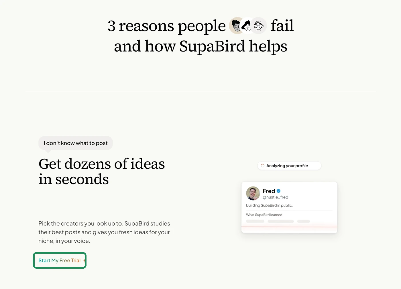
The section is now “3 reasons people fail and how SupaBird helps”. Each row leads with an outcome like “Get dozens of ideas in seconds” and ends with its own “Start My Free Trial” link. The page went from 3 of those buttons to 6.
My read
You can start the moment one problem sounds like yours, instead of scrolling past all three to find a button.

Change 3 of 6
The rewrite promise moved from a number to your voice
Before
“Our agent rewrites your posts to make them 10x more engaging. It is trained on best creators.”
After
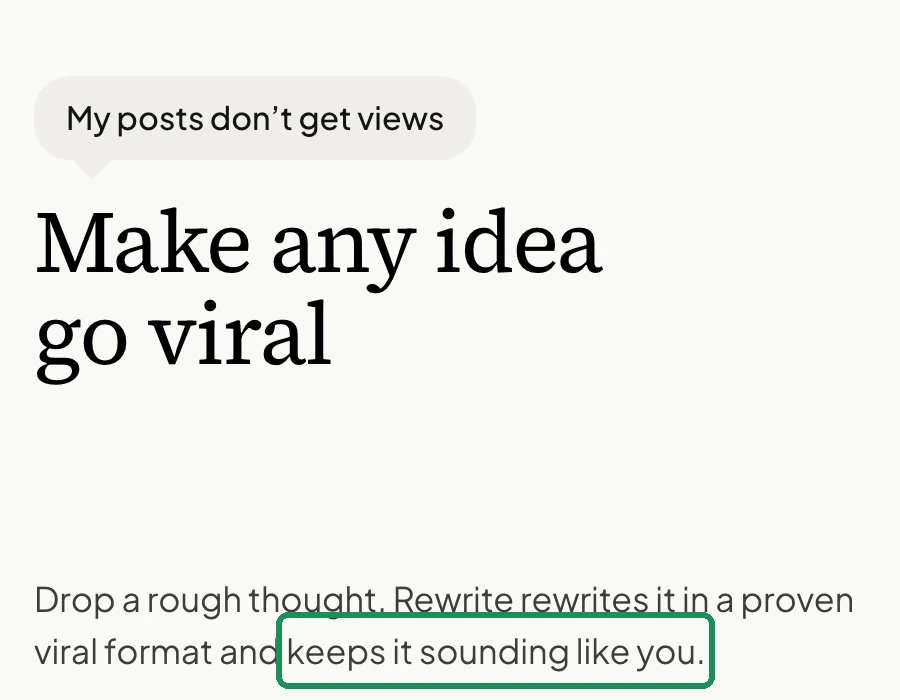
“Drop a rough thought. Rewrite rewrites it in a proven viral format and keeps it sounding like you.”
My read
People worry more about sounding like a bot than about any number, and the new line answers that worry.

Change 4 of 6
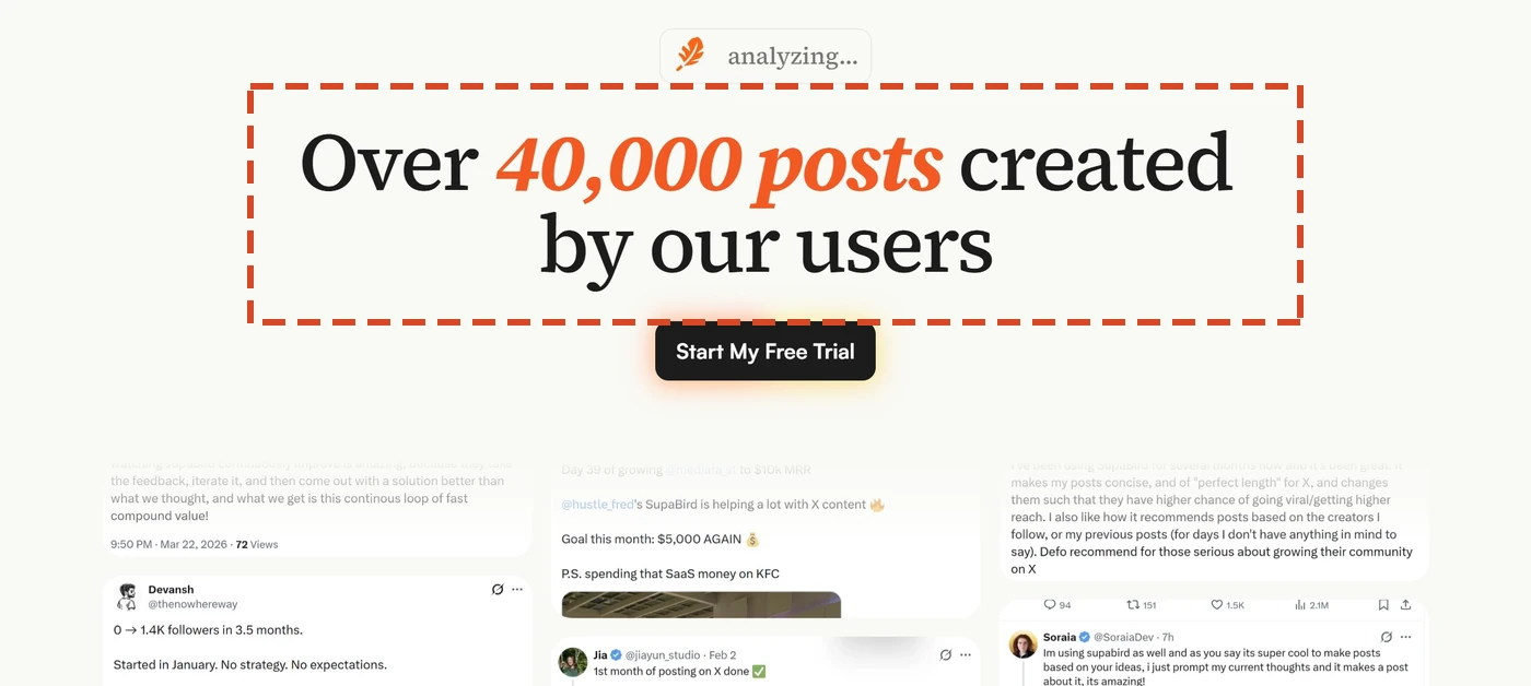
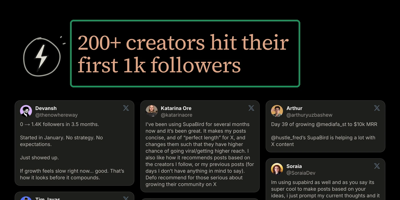
The proof counts people, not posts
Before
The testimonials sat under “Over 40,000 posts created by our users”.
After
They sit under “200+ creators hit their first 1k followers”, on a dark block. Most testimonials stayed the same.
My read
Posts created is a number about the tool, but a first 1k followers is what a visitor came for.
Change 5 of 6
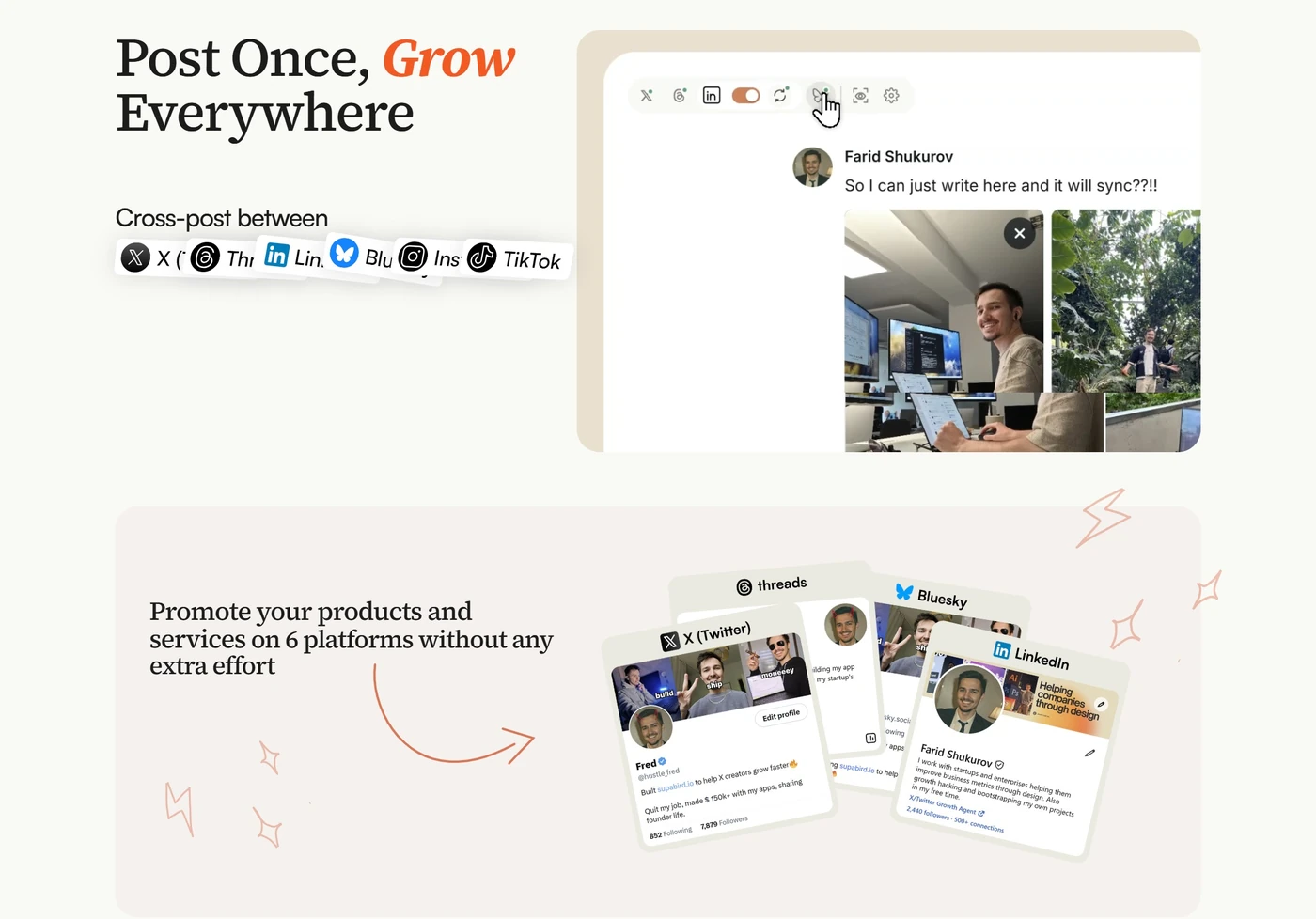
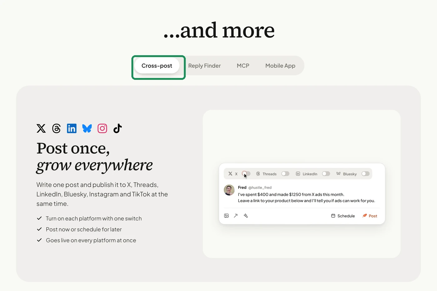
Cross-posting went from two sections to one tab
Before
Cross-posting had two full sections: “Post Once, Grow Everywhere” and “Promote your products and services on 6 platforms without any extra effort”.
After
It is one tab in an “…and more” box, next to Reply Finder, MCP and Mobile App.
My read
Everything is still on the page, but the page stops explaining it all at once. Fred’s post sums it up as “simplicity is king”.
Change 6 of 6
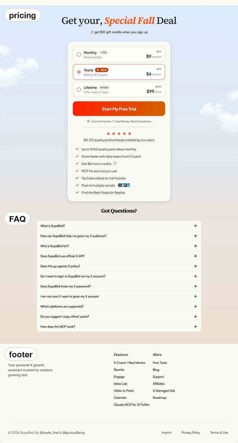
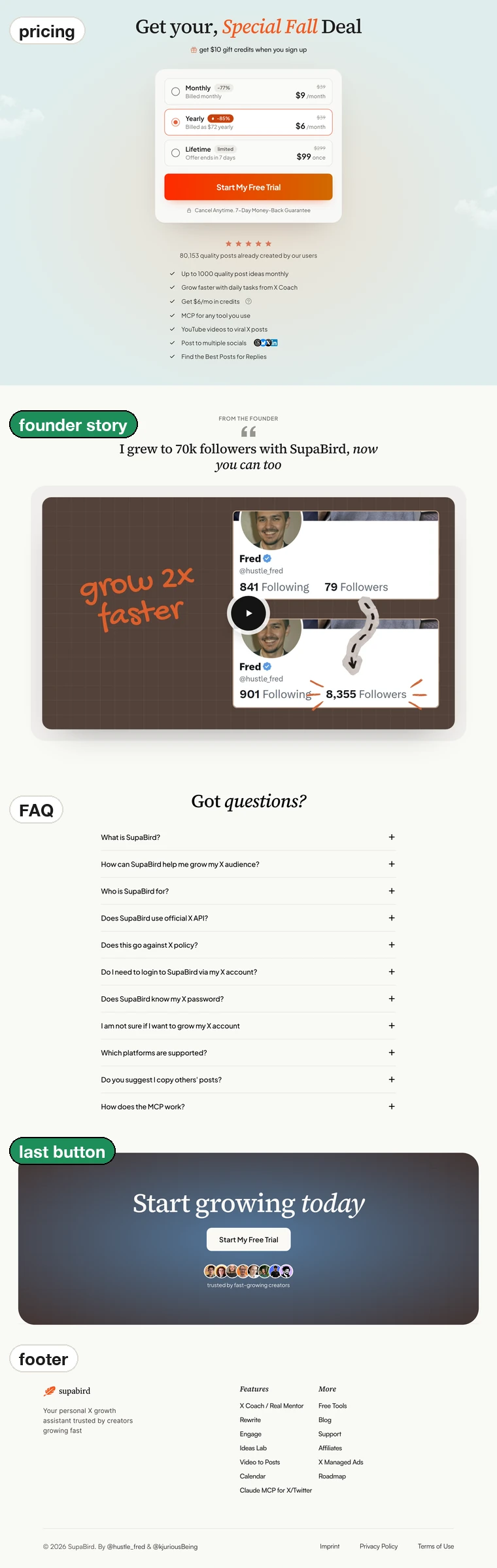
Same pricing card, new ending
Before
The page went from pricing to the FAQ to the footer.
After
The pricing card did not change. Under it, a founder story now says “I grew to 70k followers with SupaBird, now you can too”. After the FAQ, the page ends on a “Start growing today” button.
My read
If you read all the way down, a button still waits for you.
The whole page, old and new
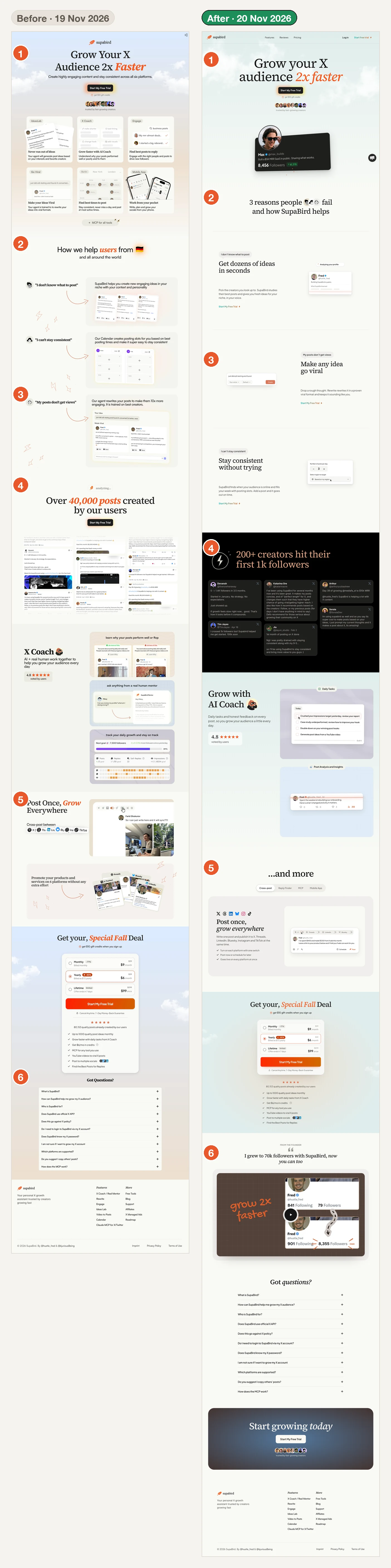
Old page on the left, new page on the right, with the same numbers as the six changes. Fred listed the rules behind the new page in a post on X: remove “learn more” buttons, skip the demo video, conversions are emotional, show benefits over features, keep text short, visuals over text, and simplicity is king.
Try this on your own page
- Put the result your buyer wants in the hero, and move the feature list lower.
- Give every problem you name its own button, right where it ends.
- Check what your main promise is about: a number, or the worry your buyer has.
- Count people in your proof headline, not things your tool made.
- End the page on a button, not on the FAQ.
What this does not prove
The 2x is Fred’s own number, from a post on X after 118k visitors and several A/B tests. I have not seen the data behind it.
All six changes went live together, so these pages can’t show which one did the most.
LandingBoost had no part in this redesign. Fred designed and built the new page, and this page only compares the two. I’m a lifetime Supabird user.
Before: a desktop capture from 19 Nov 2026. After: the live page on 20 Nov 2026, 1200 px wide. The phone layout was not compared.