
SaaS Landing Page CTA Tests: What Actually Increased Signups
Three landing page experiments show when CTA wording, navigation labels, and button choices increased signups or clicks, with metric caveats.
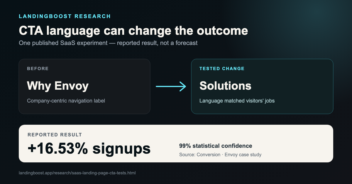
The practical pattern
- Use buyer language in navigation and CTA context, not internal company language.
- Treat click-through lifts as directional until downstream signups or revenue also improve.
- Test the action that matches the visitor's readiness: demo, trial, pricing, or purchase.
Published experiments
What changed, what the source measured, and what the result does—or does not—prove.
Completed signups
How to interpret it: A second variation that added email capture to the navigation was flat. The case therefore supports the label change in this context, not a general rule that more CTA exposure wins.
Read the primary case study at Conversion →CTA clicks
How to interpret it: The test ran for two weeks with close to 800 visitors. The published case reports clicks, not completed demos, pipeline, or revenue.
Read the primary case study at VWO →Demo and pricing-page clicks
How to interpret it: A two-button version also improved clicks, while showing price on the Buy Now button produced no real improvement. The case does not report paid conversion.
Read the primary case study at VWO →Questions founders ask
What is the best CTA for a SaaS landing page?
There is no universal winner. The CTA should match the visitor's readiness and make the next step concrete. Use your own funnel outcome—not another company's uplift—to choose the winner.
Should a SaaS CTA say free?
Only when the next step is genuinely free and the word reduces uncertainty. Corcentric reported more CTA clicks after adding “Free,” but the public case did not report downstream revenue.
What should I measure in a CTA test?
Prefer completed signups, qualified demos, activation, or revenue. Button clicks are useful diagnostic signals, but they can increase without improving customers or revenue.
Method and limits
- This article uses public case studies from the LandingBoost CRO evidence registry.
- Evidence grade B means the source names a testable change and a measured result, but not every detail required for independent replication is public.
- Vendor-published success stories overrepresent winning tests. A result is a hypothesis input, not an expected uplift.
Related research
Find the first edit on your page
LandingBoost checks clarity, CTA strength, proof, trust, and friction, then prioritizes the first conversion gap to fix.
Find my first edit free