
Do Product Screenshots Increase Landing Page Conversion?
LandingBoost reviewed 52 CRO records on screenshots, product images, and demo visuals to show when landing-page visuals helped and when they hurt.
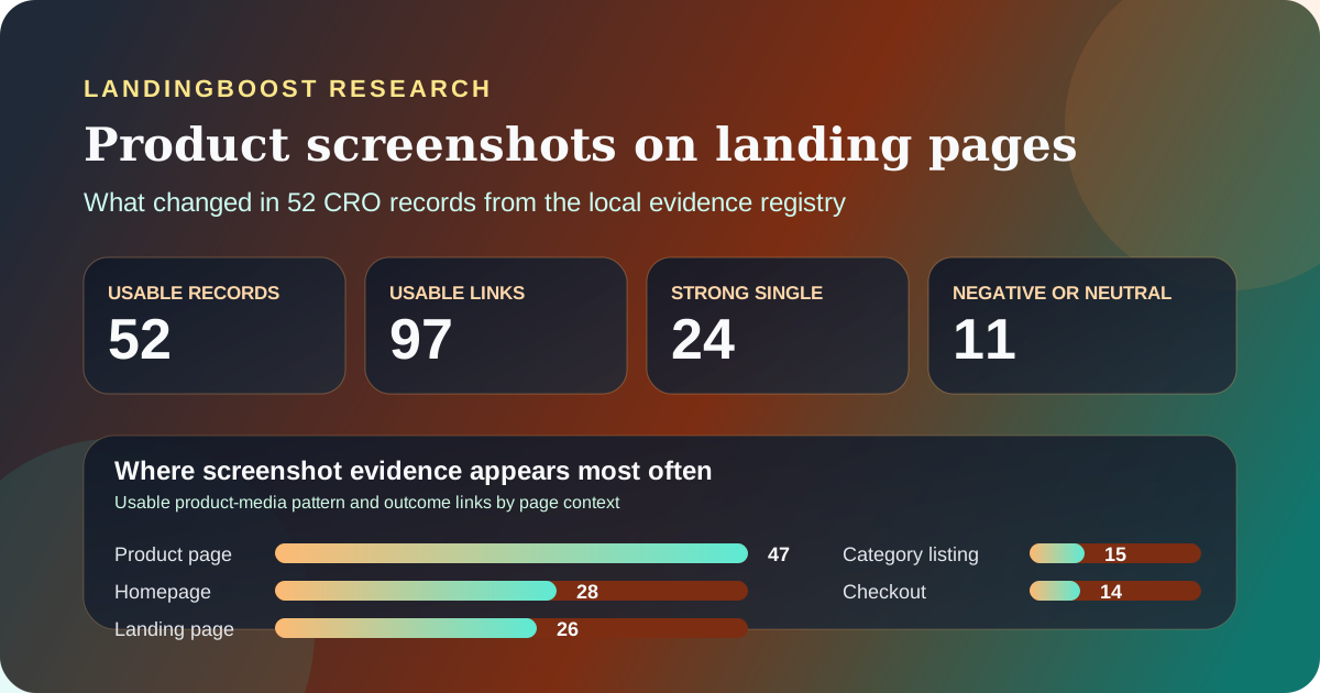
Key results
- Screenshots help most when they answer product questions faster, not when they simply decorate a hero section.
- The evidence is broader than pure landing pages, but the pattern still reaches 26 landing-page links in the local registry.
- Contradictions matter: some pages improved with more screenshots, while others improved after removing a screenshot block or rejecting video.
- The source mix is useful for hypothesis ranking and too skewed for expected-uplift claims.
Where screenshot and product-visual evidence appears most often
Usable product-media pattern and outcome links in the local registry. These are pattern associations, not one row per unique experiment, so totals exceed 52 records.
| Dimension | Usable links | How to interpret it |
|---|---|---|
| Product page | 47 | Visual evidence appears most often where buyers need to inspect features, compare options, or understand what ships before committing. |
| Homepage | 28 | Homepage tests usually use visuals to explain the product faster for visitors who are still deciding whether the offer is relevant. |
| Landing page | 26 | Landing-page evidence is large enough to support the topic, but it still shares patterns with adjacent product and tour pages. |
| Category listing | 15 | Collection views use images and product previews to reduce search cost before users click into detail pages. |
| Checkout | 14 | Even late-funnel pages still test visuals when buyers need reassurance, context, or a cleaner path to action. |
What the registry actually shows
The local registry entry behind this topic reports 52 usable records, 97 usable pattern and outcome links, 24 strong single-pattern records, and 11 negative or neutral links for product screenshots, imagery, video, and other product-visual changes. The page-context mix is broader than the keyword suggests: 47 product-page links, 28 homepage links, 26 landing-page links, 15 category-listing links, and 14 checkout links. That matters because visitors often need visual explanation before they reach a dedicated campaign page.
The source mix is also uneven enough to affect confidence. Of the 97 usable links, 83 come from VWO, 13 from Conversion, and 1 from MarketingExperiments. Ecommerce-retail accounts for 54 links, while SaaS-software contributes 22. That means the article can answer whether screenshot hypotheses recur often enough to test, but it cannot honestly claim that one screenshot style or one visual format reliably lifts every landing page.
The useful interpretation is narrower. Product visuals tend to help when they reduce uncertainty faster than text alone. They show the interface, clarify what is included, or make the next step easier to imagine. When they are decorative, redundant, or slower than the visitor's scan path, the evidence becomes mixed.
- Treat screenshot evidence as a clarity signal, not a design trend.
- Use the 26 landing-page links as topic support, while respecting that the pattern also depends on adjacent page types.
- Set confidence by the skewed source mix before translating the evidence into a live test plan.
When screenshots and product images helped
The strongest positive cases all make the product easier to picture. Conversion's FreshBooks case reports that replacing a generic branded background with an image of the product increased subscriptions by 4%. That is a small number compared with some vendor headlines, but it is a cleaner reminder of what visuals do well: they reduce anxiety by showing what the visitor is about to try.
The same principle appears more strongly in VWO's YNAB tour-page test. The winning variation showed larger screenshots on one page instead of making visitors click through categories to discover functionality. In both the source page and the local registry extract, that change is linked to an 85% increase in downloads. The portable lesson is not 'more screenshots always win.' It is that a visual tour can outperform a fragmented one when semi-interested visitors would otherwise leave before understanding the product.
Conversion's Dollar Shave Club case points in the same direction for package clarity. Separating products and their included features instead of lumping them together increased subscriptions by 11.2%. The visual change mattered because it made the offer easier to parse, not because the page looked more polished. Across these examples, the pattern is consistent: screenshots and product visuals help when they remove interpretation work from the first scan.
- Show the product when the visitor needs to understand what they will get before acting.
- Use visuals to collapse clicks and search cost, especially on tour or explainer paths.
- Pair screenshots with clearer packaging or labels when the real problem is interpretation, not awareness.
When visuals hurt or stopped helping
This topic would be misleading without the contradictions. VWO's Brookdale Living test found that a page with a static image increased conversions by 3.92%, while the richer video version did not win. That is a useful correction to the easy advice that demo video is always more persuasive than a screenshot or image. If visitors already understand the offer and want to move quickly, motion can become friction instead of proof.
The AssessmentDay example is even harsher on one-size-fits-all rules. In the local registry extract, the product-media association is tied to the source page's cautionary result: after removing both the FAQ section and the screenshots section, the conversion rate dropped by about 3%. That does not prove screenshots always belong on a landing page. It proves that once the page removes too much context, the remaining content can stop selling the action.
The practical implication is that visuals work only in relation to the page's job. If the page still needs to explain the product, screenshots can carry that burden faster than prose. If the page already has enough intent and the visual block adds one more thing to inspect, removing or simplifying it may help. The registry supports both outcomes, which is exactly why the safe recommendation is diagnostic rather than prescriptive.
- Do not assume video beats static imagery on pages with strong existing intent.
- Removing screenshots can help on cluttered pages, but removing too much context can reverse the gain.
- Evaluate every visual block by the job it does for the next decision, not by how impressive it looks.
How to use this evidence on your own landing page
Start with the decision barrier, not the asset type. If visitors are unsure what the product does, show the product sooner. If they already understand the product but hesitate on trust or effort, more screenshots may be irrelevant and a stronger proof or CTA path may deserve the space instead. The article's evidence is useful because it narrows which questions to ask first, not because it hands out a universal screenshot template.
A practical test plan is usually one step more specific than 'add screenshots.' For example: show the real interface above the fold, replace abstract illustration with a concrete workflow image, reduce the number of clicks needed to inspect core features, or remove a low-signal media block that delays the CTA. Each of those is measurable against the page's actual outcome, whether that is signups, qualified leads, purchases, or revenue.
That is the people-first value of the dataset. It helps a founder decide whether the missing element is product visibility, product comprehension, or page focus. It does not justify telling a buyer that screenshots should increase conversion by 4%, 11.2%, or 85% on their own page. Those numbers belong to the cited companies and contexts. Your page still needs its own evidence.
- Write the hypothesis around the uncertainty you are removing, not around the asset you want to add.
- Measure the downstream action that matches the page's role, not just shallow engagement.
- Keep the visual that earns its space in the first scan path, and remove the one that delays the next decision.
Linked sources for the claims in this article
Questions founders ask
Should I put product screenshots above the fold on a landing page?
Only when the first barrier is product understanding. If visitors need to see the interface or output to trust the offer, screenshots can earn above-the-fold space. If the real blocker is credibility, pricing, or CTA clarity, a screenshot may not be the first fix.
Are screenshots better than demo videos on landing pages?
Not universally. Brookdale's cited case is a reminder that a static image can beat a richer video when the page already has intent and the video adds friction. Choose the format that gets the visitor to understanding fastest.
Can removing screenshots improve conversion?
Yes, when the screenshot block is redundant or distracts from the next action. The wider registry contains both wins from stronger product visuals and losses from removing too much context, so the right question is what job the visual is doing on the page.
How many screenshots should a landing page use?
Use the minimum number needed to answer the next product question. A single strong screenshot, a compact tour strip, or one workflow image can outperform a long gallery if the visitor already understands the offer.
Can I expect the same lift these screenshot tests reported?
No. The reported lifts are historical outcomes from other companies in vendor-published case studies. Use them to prioritize what to test on your page, then measure the change against your own downstream metric.
Method and limits
- Aggregate counts in this article come from the local CRO evidence registry entry for the product_content_media pattern, generated from the registry snapshot dated 2026-07-15.
- The report counted 97 usable intervention and outcome links across 52 unique records, including 26 links tagged to landing pages and 11 negative or neutral links.
- LandingBoost verified every quantitative claim in the article against the local registry extract and the linked public primary page, while republishing no full article body and no third-party screenshots.
- Page-context totals are pattern associations rather than one-row-per-experiment counts, so they show where screenshot and product-visual work recurs most often, not a standalone experiment inventory.
- The evidence mix is dominated by vendor-published grade B case studies, especially VWO and ecommerce examples, so the dataset is descriptive and useful for prioritization, not for expected-uplift claims.
Useful next steps
Related research
Find the first testable edit on your page
LandingBoost checks clarity, CTA strength, proof, trust, and friction, then prioritizes the first conversion gap to fix.
Find my first edit free