
Landing Page Visual Hierarchy: What 102 Experiments Changed
LandingBoost reviewed 102 visual-hierarchy CRO records to show which landing-page layout and CTA placement changes improved clicks, signups, and sales.
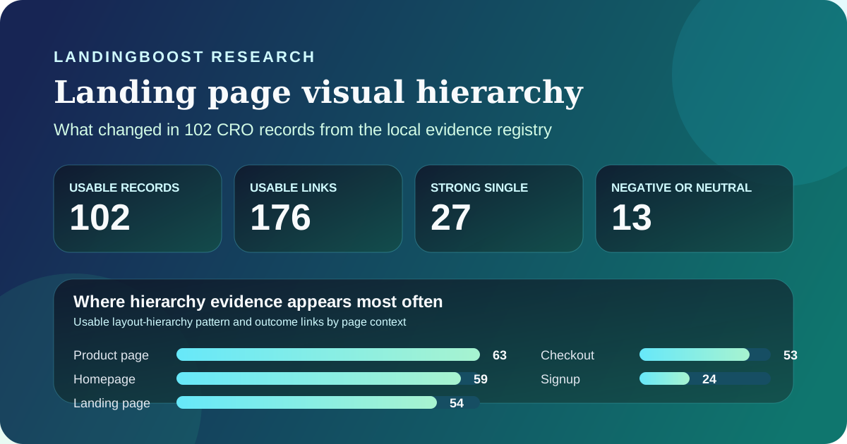
Key results
- Winning hierarchy changes usually surface the primary action or the key clarification earlier, instead of simply restyling the page.
- Hierarchy evidence repeats across product pages, homepages, landing pages, and checkout flows, which suggests sequencing matters throughout the funnel.
- Negative examples exist, so moving a CTA or navigation item to a less visible position can hurt sharply even when the rest of the page stays the same.
- The dataset is useful for ranking hypotheses, but the source mix is too skewed to support expected-uplift claims.
Where visual-hierarchy evidence appears most often
Usable layout-hierarchy pattern and outcome links in the local registry. These are pattern associations, not one row per unique experiment, so totals exceed 102 records.
| Dimension | Usable links | How to interpret it |
|---|---|---|
| Product page | 63 | Hierarchy often decides whether buyers can compare, trust, and act without hunting through tabs, specs, or support copy. |
| Homepage | 59 | Homepage hierarchy still carries the first job of sequencing the promise, proof, and next step for cold traffic. |
| Landing page | 54 | Dedicated campaign pages repeatedly test what belongs above the fold, what can wait, and how much choice a visitor should see first. |
| Checkout | 53 | Hierarchy keeps mattering after intent exists, because cluttered plan, cart, or form layouts can still derail commitment. |
| Signup | 24 | Signup hierarchy usually changes perceived effort by simplifying field order, form length, or the visibility of the next action. |
What the registry actually shows
The local registry entry behind this topic reports 102 usable records, 176 usable pattern and outcome links, 27 strong single-pattern records, and 13 negative or neutral links for layout, visual hierarchy, and element placement. The page-context mix is broad: 63 product-page links, 59 homepage links, 54 landing-page links, 53 checkout links, and 24 signup links. That spread is the practical signal. Visual hierarchy is not just a hero-section concern. It keeps shaping how visitors scan, compare, and commit all the way through the funnel.
The source mix also explains why the article has to stay cautious. Of the 176 usable links, 141 come from VWO, 22 from Conversion, and 13 from MarketingExperiments. Most are grade B public case studies rather than independent replications. So the dataset is strong enough to tell you that hierarchy is worth testing and weak enough that it cannot justify promising a specific lift from a cleaner layout.
Used correctly, the data answers a narrower question: what kinds of hierarchy changes recur often enough to deserve serious diagnostic attention? The repeated answer is sequencing. The strongest cases surface the main action, the most important clarification, or the proof needed to keep the visitor moving. They do not simply add more sections, more colors, or more motion.
- Treat hierarchy as a prioritization problem, not a beauty pass.
- Read page-context counts as repeated associations, not as a universal formula for every page type.
- Use the source mix to set confidence: helpful for ranking hypotheses, weak for forecasting lifts.
Which hierarchy changes actually helped
The linked source pages converge on a simple pattern. ArchiveSocial moved its primary CTA to a more prominent first-fold position on the right and made the button more legible with differentiating color. VWO reports that the variation improved clicks on the form field by 101.68% over a 27-day test. That is not evidence that every right-side CTA wins. It is evidence that when the next step was hard to notice, hierarchy and emphasis mattered enough to change behavior sharply.
MarketingExperiments shows the same idea in a more explicit landing-page example. In its 'Landing Page Confusion' case study, the optimized page increased click-through rate from 13.80% to 22.91%, a 66.01% relative lift, after the page was redesigned to flow toward one primary objective. The lesson is not that every two-column page is wrong or that every minimalist page is right. The lesson is that elements should support the single objective instead of competing with it.
Conversion's Envoy case is useful because it combines hierarchy with language clarity. The team found that the value points hidden under the 'Why Envoy' navigation label were easy to miss. Renaming the label to 'Solutions' and surfacing that framing earlier led to a 16.53% increase in signups at 99% statistical confidence, while a different variation that shifted links and added an email field ended flat. That makes the portable insight more specific: hierarchy helps most when it reveals a meaningful clarification, not when it simply moves modules around.
- Bring the primary action and the key reason to believe into the first scan path.
- If a navigation label hides value, rewrite the label before adding more surface area.
- Above-the-fold placement matters most when it reduces search cost for the next action.
What the failures change about the advice
Negative outcomes are the corrective to easy best practices. VisitNorway tested moving its Order link from the second position in the main menu toward the end of the menu and reported a 72% to 73% decline in clicks to the Book Norway CTA. That is exactly why generic hierarchy advice is dangerous. A layout change can look cleaner to the team and still bury the action visitors were already trained to use.
Envoy's own flat variation carries the same warning. Adding an email capture field and shifting primary navigation links did not beat the simpler label change. More visible interface elements are not automatically better hierarchy. They can add competing actions or ask for commitment before the visitor is ready.
The practical takeaway is to define the page objective before you redesign the page. If the visitor still needs education, surface the clearest explanation first. If the visitor already understands the offer, surface the next action and the trust needed to take it. If you skip that diagnostic step, hierarchy work becomes a cosmetic reshuffle and the odds of a regression rise.
- Do not move a high-performing CTA or nav action deeper into the scan path without evidence.
- More visible modules can still create distraction if they introduce an extra decision too early.
- Validate hierarchy changes against the page's actual objective, not against a generic design rule.
How much confidence this evidence deserves
The registry is useful for pattern recognition because the topic is no longer supported by one or two anecdotal wins. It is also limited in ways that matter. The evidence is vendor-published, mostly grade B, and concentrated in a single source library. Large reported lifts often come from multi-change treatments where hierarchy, copy, proof, and CTA emphasis all moved together. That makes the evidence descriptive, not predictive.
The safest way to use the dataset is to narrow the hypothesis. Instead of saying 'better visual hierarchy will increase conversions,' say which uncertainty you are reducing: hidden CTA, buried proof, unclear plan differences, cluttered form sequence, or too many competing actions above the fold. Then measure the downstream metric that actually matters for the page: click-through, signup, qualified lead, purchase, or revenue.
That is the people-first use of this article. It helps a founder or designer decide what to inspect first on a real page. It does not tell them that moving one block above the fold will recreate someone else's 66% click-through lift or 101.68% form-click lift. Historical outcomes belong to the cited source pages. Your page still needs its own test.
- Use the registry to rank hierarchy hypotheses, not to estimate expected uplift.
- Prefer the measured business outcome that matches the page's role in the funnel.
- Preserve source rights boundaries by citing public facts only and not republishing screenshots or article bodies.
Linked sources for the claims in this article
Questions founders ask
What should I move above the fold first on a landing page?
Move the element that reduces the biggest decision barrier first: the primary CTA, the clearest explanation of the offer, or the proof needed to trust the next step. The examples in this dataset win when they reduce search cost for the visitor, not when they simply add more modules near the top.
Does visual hierarchy matter more than copy?
Usually they work together. Envoy's winning test improved hierarchy by surfacing a clearer label, while ArchiveSocial improved prominence for the main CTA. If the page hides the right idea, better copy and better sequencing often need to ship together.
Can moving navigation or CTAs hurt conversion?
Yes. VisitNorway reported a 72% to 73% decline in clicks when an Order link was moved deeper into the menu. A cleaner-looking page can still underperform if it pushes a familiar high-intent action out of the visitor's scan path.
Can I expect the same lift these hierarchy tests reported?
No. The reported lifts are historical outcomes from other companies, mostly in vendor-published case studies. Use them to prioritize what to inspect and test on your page, then validate the change with your own traffic and downstream metric.
Method and limits
- Aggregate counts in this article come from the local CRO evidence registry entry for the layout_hierarchy pattern, generated from the registry snapshot dated 2026-07-15.
- The report counted 176 usable intervention and outcome links across 102 unique records, including 54 links tagged to landing pages and 13 negative or neutral links.
- LandingBoost verified every quantitative claim in the article against the local registry extract and the linked public primary page, while republishing no full article body and no third-party screenshots.
- Page-context totals are pattern associations rather than one-row-per-experiment counts, so they show where hierarchy work recurs most often, not a standalone experiment inventory.
- The evidence mix is dominated by vendor-published success stories and mostly grade B records, so the dataset is descriptive and useful for prioritization, not for expected-uplift claims.
Useful next steps
Related research
Find the first testable edit on your page
LandingBoost checks clarity, CTA strength, proof, trust, and friction, then prioritizes the first conversion gap to fix.
Find my first edit free