
SaaS Pricing Page Tests: What Reduced Offer and Pricing Friction
LandingBoost reviewed 86 pricing-offer CRO records to show which SaaS pricing page changes improved demos, revenue, and plan selection.
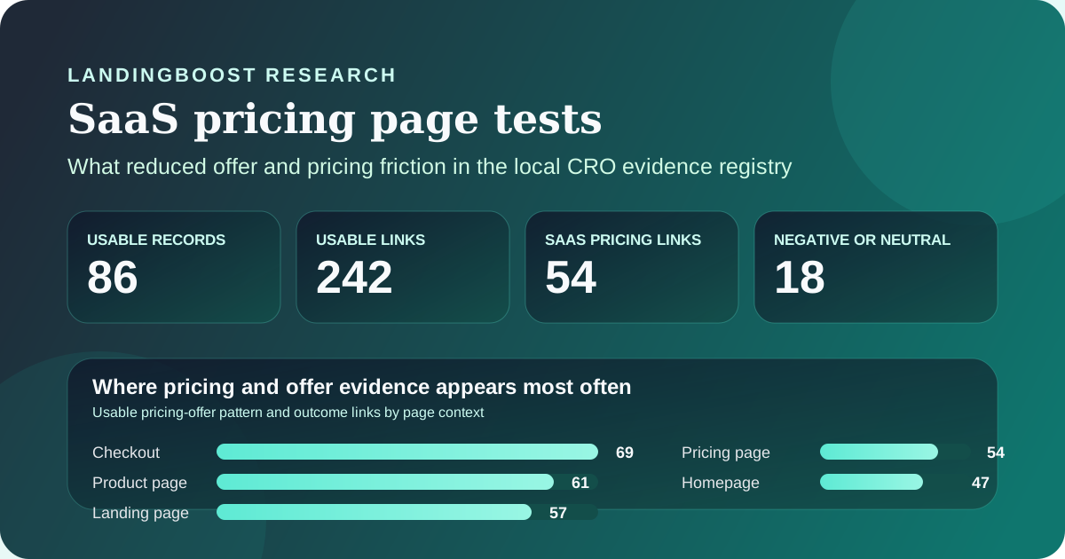
Key results
- Winning pricing-page tests usually reduce interpretation work: clearer plan differences, clearer packaging, or clearer enterprise routing.
- Several sources improved downstream revenue quality, not just top-funnel clicks, which matters more than CTR alone on a pricing page.
- The registry also includes failures and trade-offs, so pricing experiments can improve revenue while reducing free signups or volume.
- Most evidence comes from vendor case-study archives, so treat it as hypothesis input rather than expected uplift guidance.
Where pricing and offer evidence appears most often
Usable pricing-offer pattern and outcome links in the local registry. These are associations, not unique experiments, so totals exceed 86 records.
| Dimension | Usable links | How to interpret it |
|---|---|---|
| Checkout | 69 | Offer clarity still matters at the final commitment step; the buyer can remain confused even after deciding to evaluate a product. |
| Product page | 61 | Packaging questions often begin before the formal pricing page, especially when feature depth and use case fit are unclear. |
| Landing page | 57 | Acquisition pages often need to preframe the offer so the pricing page does not absorb all the explanation work later. |
| Pricing page | 54 | Dedicated pricing-page evidence is substantial enough to treat plan presentation and packaging as a repeatable test area. |
| Homepage | 47 | Homepage message and pricing-page clarity reinforce each other; a weak handoff between them can still slow serious buyers. |
What the winning pricing tests clarified
The local registry entry behind this topic reports 86 usable records, 242 usable pattern and outcome links, 43 strong single-pattern records, and 18 negative or neutral links for pricing, packaging, trials, and offer structure. That is enough repetition to treat pricing clarity as a serious test class. It is not enough to assume that any one table layout, discount, or plan naming pattern will transfer cleanly to your page.
The practical pattern is consistent across the strongest SaaS examples. Wistia restructured its pricing so every plan included the same features and the major difference became upload volume; Conversion reported that sales more than doubled and revenue increased by 46%. Powtoon tested storage presentation on its pricing page and reported a 27.9% revenue increase when the winning variant made the value difference concrete with 10 GB versus 2 GB instead of a vague 'unlimited' comparison. In both cases, the work was less about visual novelty and more about giving buyers a simpler way to understand what they were paying for.
The same lesson appears in lower-funnel click and lead examples. BaseKit described its pricing-page variation as bolder, brighter, and clearer, with a testimonial and more obvious currency selection, and reported a consistent 25% improvement in click-through rate to the Buy Now page. Lyyti redesigned its pricing page so feature differences were more explicit and multiple CTAs were easier to find; VWO reported a 93.71% increase in visits to the lead-generation page at 96% significance. The portable lesson is not that more columns or more CTAs always win. It is that plan differences and next steps need to be obvious enough that serious buyers stop bouncing between pages to decode them.
- Make the pricing variable legible: quantity, usage, seat count, or scope should be easier to compare than the label alone.
- Use copy and layout to explain which plan fits which buyer, especially when enterprise routing exists.
- Treat testimonials, currency cues, and CTA placement as clarity aids, not decorative extras.
Why downstream metrics matter more than CTR
A pricing page can improve click volume while still harming business quality, so the best source pages are the ones that report what happened after the click. Omnisend is useful for that reason. Its enterprise-focused pricing-page variation made custom pricing easier to discover and explained value more clearly for different business sizes; VWO reported a 22.97% increase in demo requests, a much higher lead-to-paid rate of 11.54% versus 2.94%, a 14% increase in self-service new-business MRR, and a 16.69% increase in overall new-business MRR. That is stronger evidence than a CTR-only story because the page improved both intent capture and downstream commercial quality.
The negative examples are just as useful. Server Density tested packaged pricing starting at $99 per month instead of configurable per-unit pricing. The result was not a universal win signal: free signups dropped by 24.96%, yet total revenue increased by 114%. That trade-off matters for SaaS teams deciding whether the pricing page should maximize trial volume, qualified pipeline, or revenue efficiency. If your north-star metric is only signups, you could reject a change that actually improves the business.
This is why the dataset should influence sequencing more than design imitation. LandingBoost found 54 usable SaaS pricing-page links across 12 source pages, but those links mix clicks, demo requests, lead-generation visits, revenue, and signup outcomes. Before copying a layout pattern, decide which downstream metric your pricing page should optimize for. Otherwise a visually cleaner page can still move the wrong number in the wrong direction.
- Track the metric that matches your sales motion: self-serve revenue, lead quality, activation, or paid conversion, not just clicks.
- Record trade-offs explicitly when pricing gets more restrictive or more enterprise-oriented.
- Treat a higher-commitment CTA as a packaging decision, not only as button copy.
How much confidence the registry deserves
The evidence is useful, but it is not evenly distributed. Of the 242 usable links for this pattern, 197 came from VWO, 38 from Conversion, and 7 from MarketingExperiments. The dedicated SaaS pricing-page subset is even more concentrated: 50 links from VWO and 4 from Conversion across 12 source pages. That concentration is one reason to publish exact source attribution and rights notes instead of pretending the registry is a neutral panel dataset.
The other limitation is publication bias. These are mostly public success stories, not a random sample of every pricing-page experiment that teams run. Many records are grade B rather than independently reproducible grade A evidence, and page-context totals are pattern associations rather than one-row-per-test counts. That means the registry is better for pattern recognition than for lift prediction.
Used correctly, the dataset still helps. It suggests that pricing-page work is worth testing when buyers are confused about plan fit, package boundaries, or what happens next. It does not justify saying a clearer pricing page will increase demos by 22.97% or revenue by 27.9% on your site. The correct use is to write a narrower hypothesis, choose the downstream metric that matters, and validate it with your own traffic and buying motion.
- Use the registry to rank hypothesis classes, not to estimate expected uplift.
- Prioritize tests where buyers appear to compare features, pricing logic, or enterprise routing repeatedly.
- Keep source rights constraints intact: summarize facts with attribution and do not republish third-party screenshots.
Linked sources for the claims in this article
Questions founders ask
What should I test first on a SaaS pricing page?
Start with the point of confusion that blocks a serious buyer: plan fit, feature differences, enterprise routing, or trial expectations. The strongest examples in this dataset make the value boundary easier to understand before they worry about cosmetic polish.
Are pricing-page click-through lifts enough to trust a result?
Not by themselves. CTR helps when the page's only job is to move a buyer to the next step, but pricing changes can also affect lead quality, activation, paid conversion, and revenue. Omnisend and Server Density are useful precisely because they report downstream business impact, not only clicks.
Do package changes count as pricing-page optimization?
Yes. Several of the strongest cases changed packaging logic rather than visual design alone. Wistia changed the feature boundary across plans, Powtoon changed how storage value was expressed, and Server Density tested packaged pricing instead of per-unit pricing.
Can I expect the same uplift these pricing tests reported?
No. The reported lifts are historical outcomes from other companies, mostly in public success stories. Use them to generate narrower hypotheses and to choose the right downstream metric, then validate the change with your own traffic and buyer journey.
Method and limits
- Aggregate counts in this article come from the local CRO evidence registry entry for the pricing_offer pattern, generated on 2026-07-15 and stored in exports/pattern-evidence.json.
- The report counted 242 usable intervention and outcome links across 86 unique records; the SaaS pricing-page subset contained 54 usable links across 12 source pages.
- LandingBoost verified every quantitative claim in this article against the local registry extract and the linked public primary page, while republishing no full article body and no third-party screenshots.
- Page-context totals are associations rather than one-row-per-experiment counts, so they show where the pattern recurs most often, not a standalone experiment inventory.
- The evidence mix is dominated by vendor-published success stories and mostly grade B records, so the dataset is descriptive and useful for prioritization, not expected-uplift claims.
Useful next steps
Related research
Find the first testable edit on your page
LandingBoost checks clarity, CTA strength, proof, trust, and friction, then prioritizes the first conversion gap to fix.
Find my first edit free